What color goes best with green? It turns out that the right combination is so beautiful and super healing!
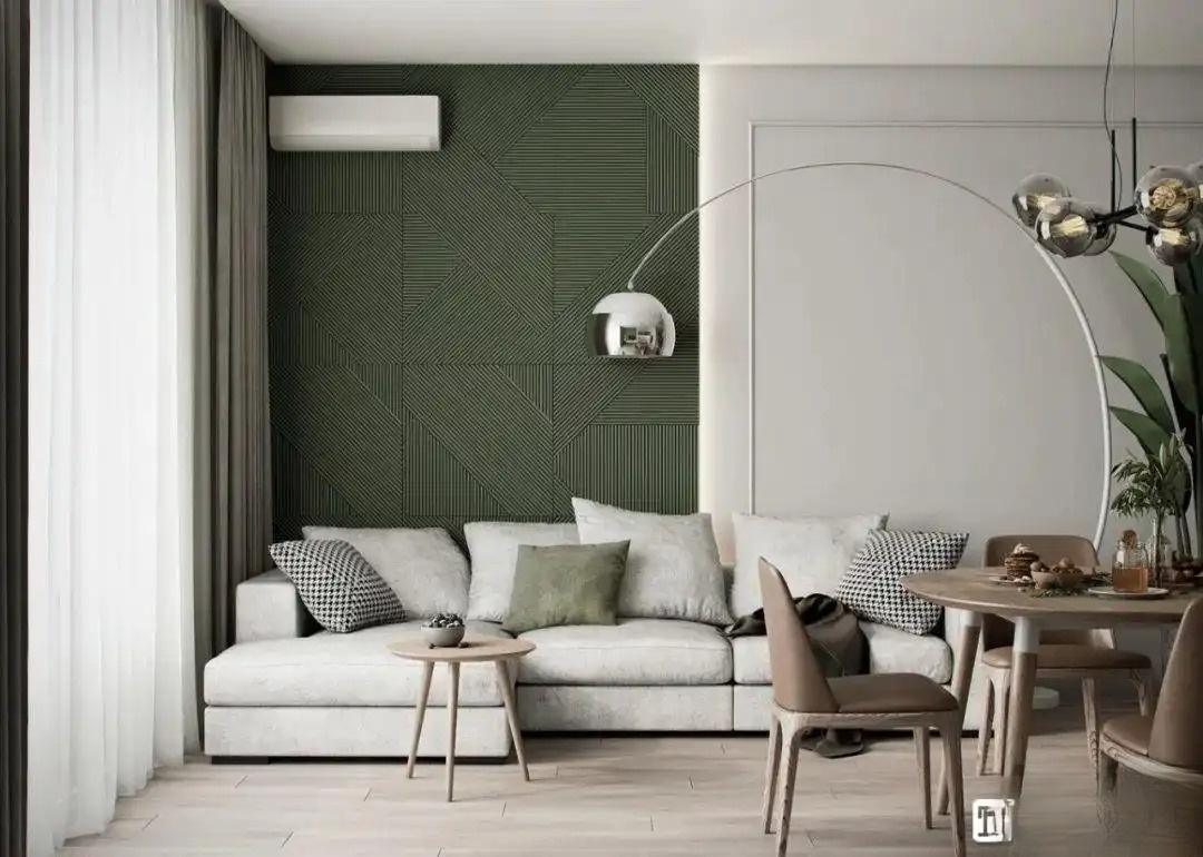
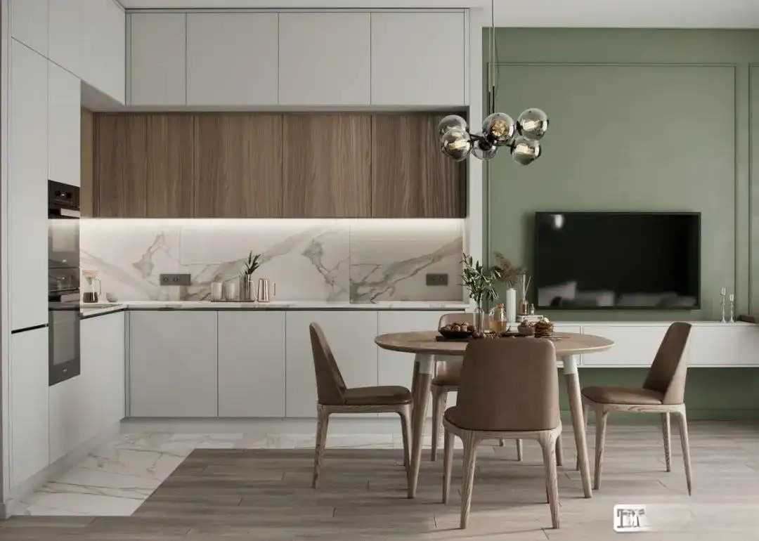
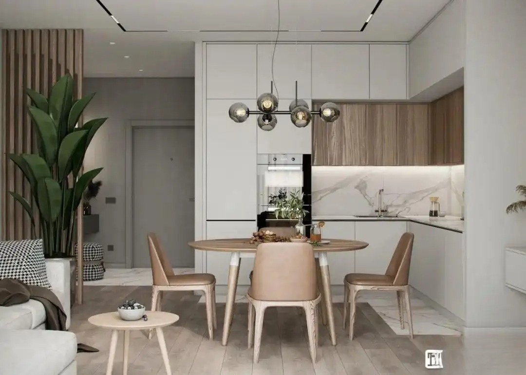
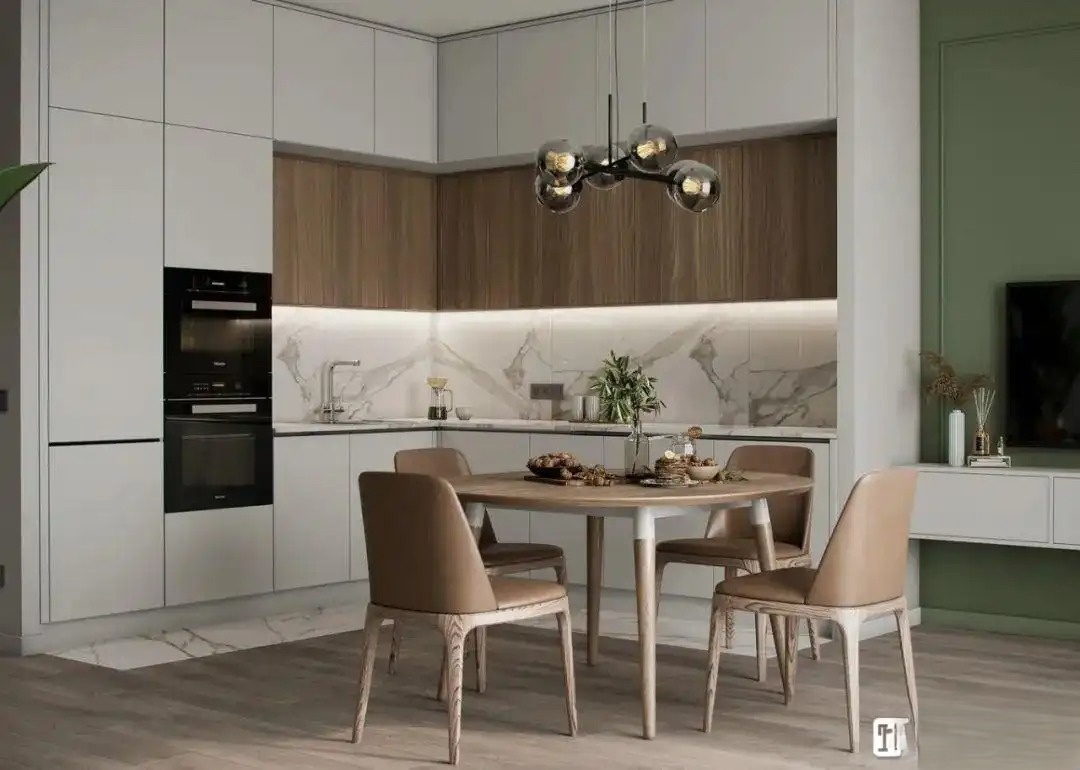
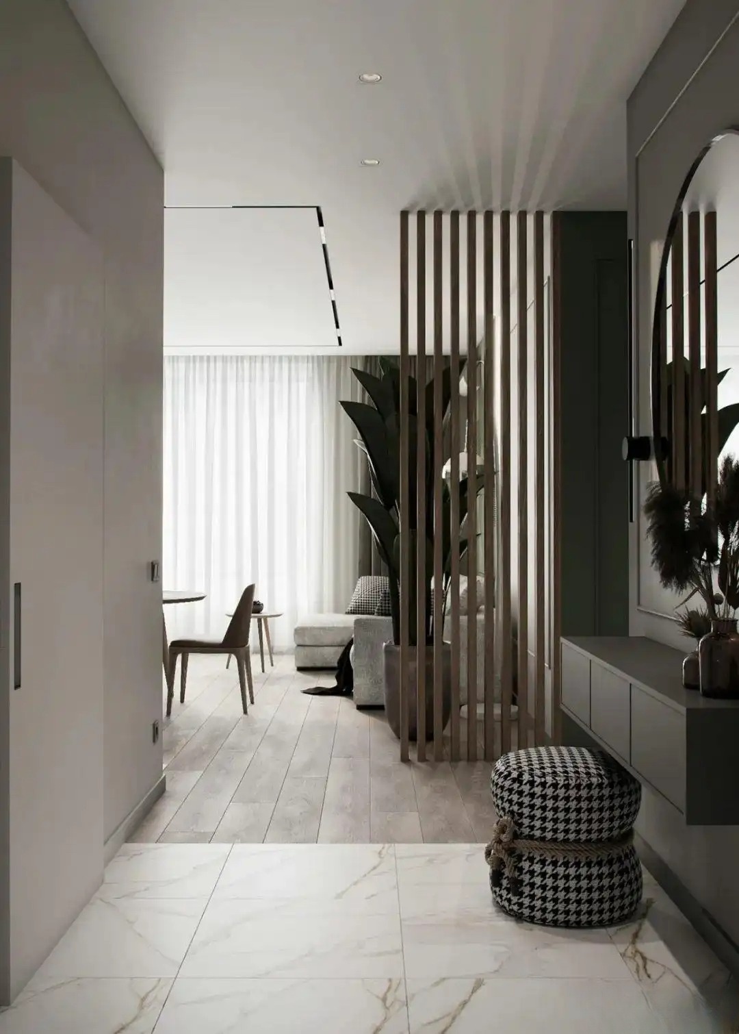
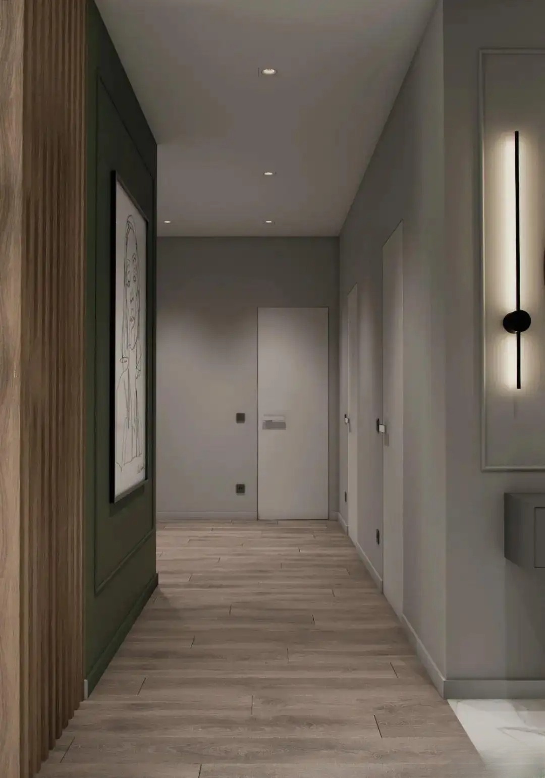
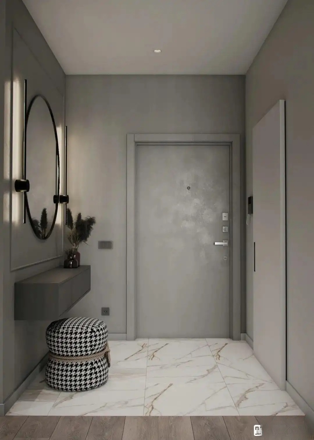
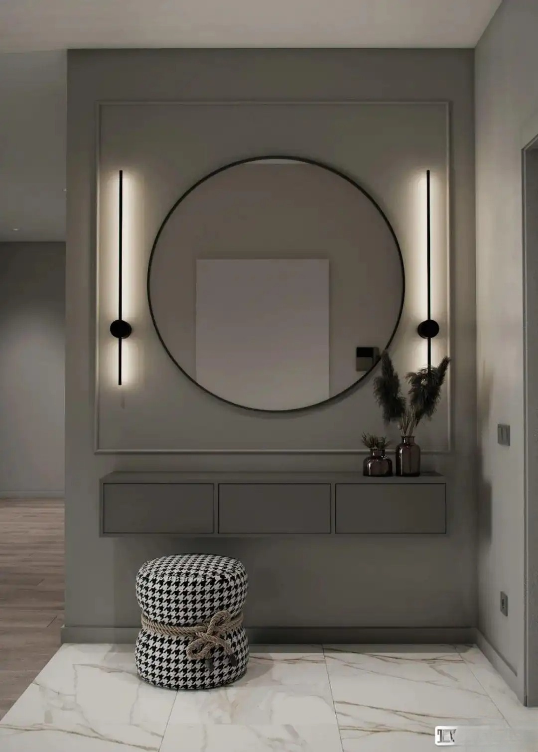
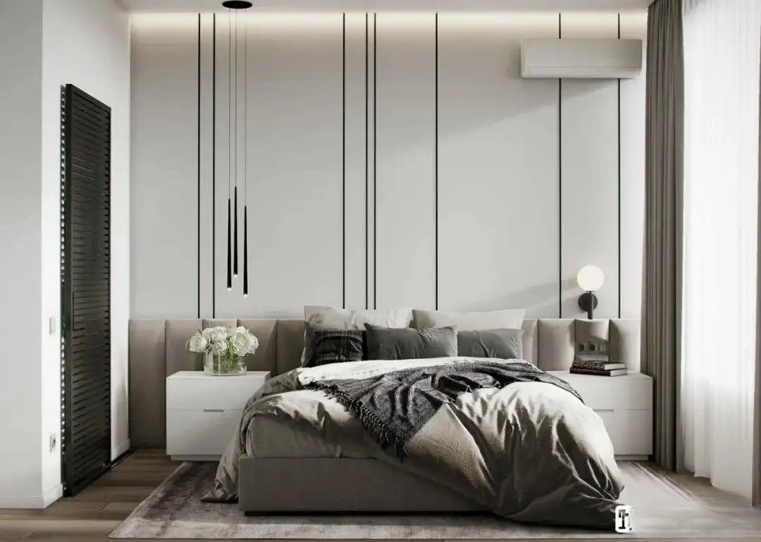
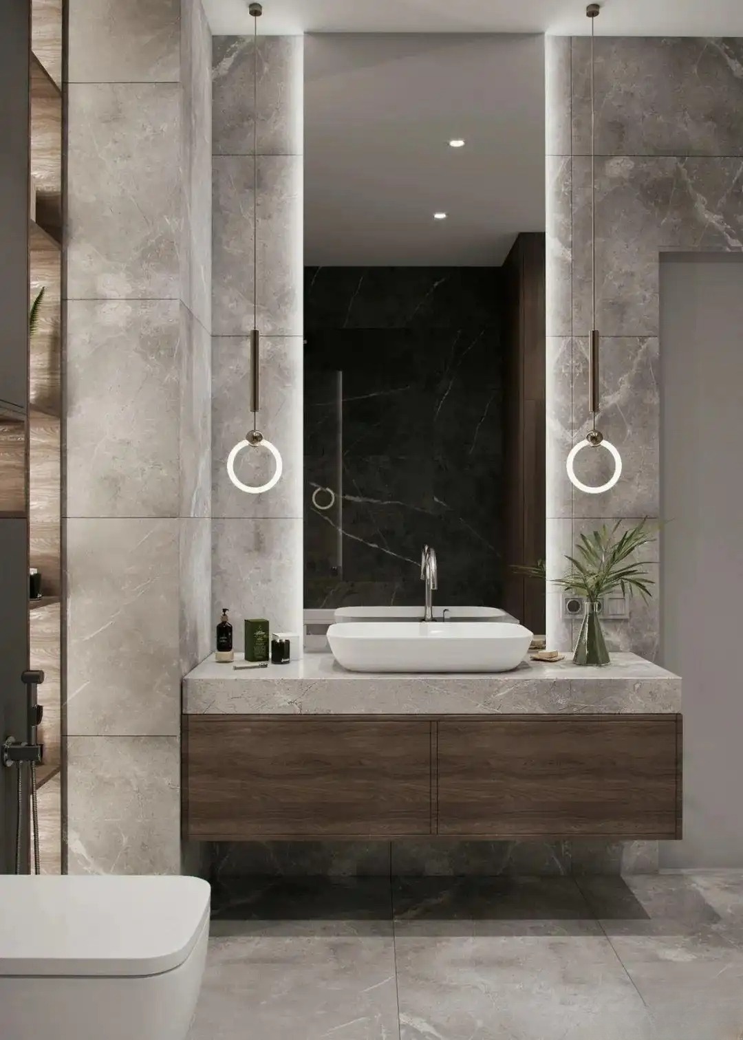
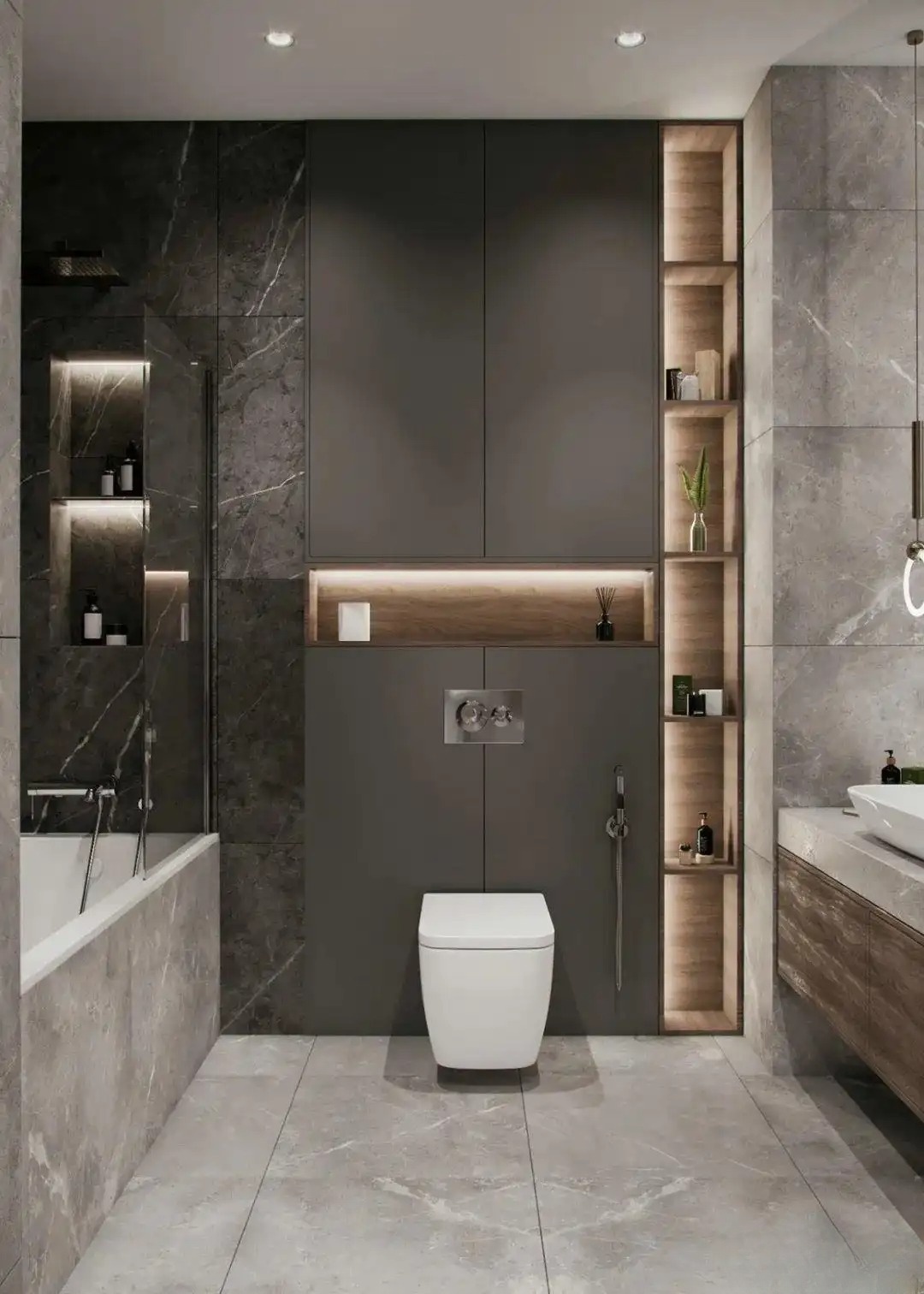
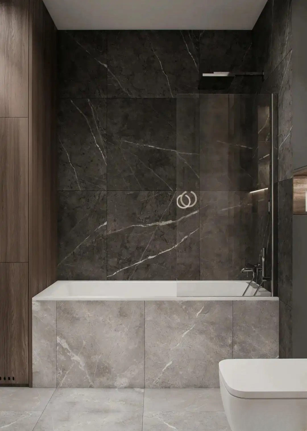
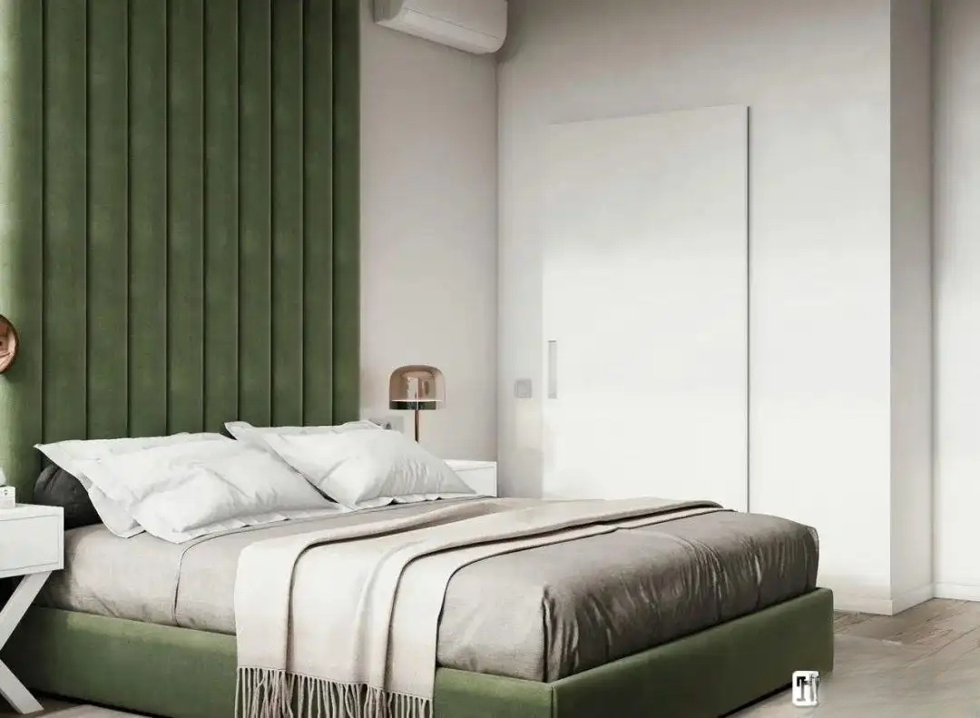
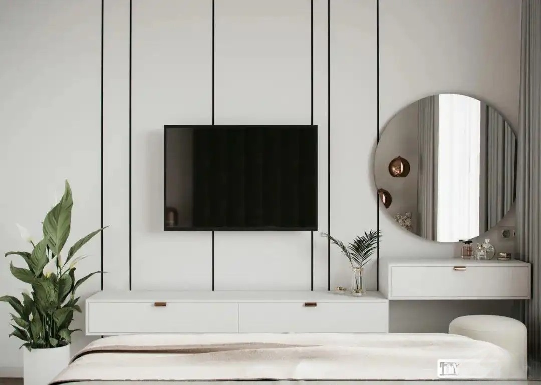
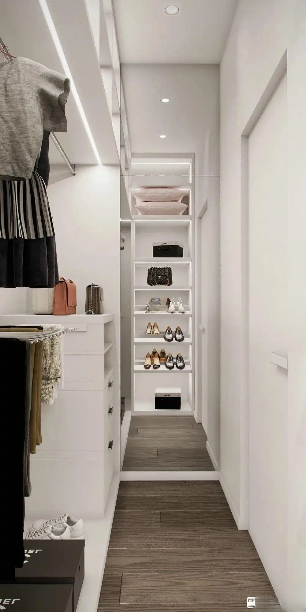
In interior design, we are used to using warm or light colors for design and matching, except for black, white and gray. It is better to use less bright colors, such as green, purple, blue, etc., in the home space. Because if they are not matched well, it will be very bad.The designer made a clever combination of colors, using gray, white and wood to create a clean and neat visual effect, adding a touch of green at the tip, which is simple, elegant, tranquil and romantic. Green is more suitable for matching with wood grain and white, which can create a sense of nature, giving people a more comfortable feeling both visually and psychologically. The living room and kitchen are integrated, with wood and green as the main colors. A large number of wooden furniture are matched with light-colored soft furnishings, creating a fresh and artistic home atmosphere. Place a set of cedar green sofas in places with excellent lighting, such as near doors and windows. The bright color combined with the bright light instantly brightens the space.Today, after seeing these spaces with green as the main color, you may change your view of these colors, because such color combinations are really unique and beautiful. Green can also relieve fatigue and keep people in a good mood. The perfect combination of green in the interior space makes the space more charming and gives people a sense of tranquility.The entrance hall is mainly gray, with storage cabinets, dressing mirrors, and shoe benches. It is simple and layered, full of beauty, and looks more upscale. People feel calm in an environment with short-wavelength colors (such as green and blue), and are more easily excited and agitated in an environment with long-wavelength colors (such as red and yellow).The background wall behind the bed in the master bedroom uses a large area of white finish, combined with black striped finishes, which looks avant-garde and full of design sense. Therefore, the material and color are matched, the white translucent curtains are hidden in the bay window, and the dark blackout curtains are installed in the bedroom. The installation of this curtain seems to make the bedroom look more atmospheric .The main bathroom is decorated in a combination of gray marble and log color, with a suspended cabinet as the background and a large mirror cabinet. While satisfying the storage function, it also has a certain visual extension effect. The second bedroom is gray + green, and the design focuses on practicality without too much decoration. Elegant and simple without losing the trend of fashion is the message conveyed to us by this design. The background adopts a light silver birch color, which is fresh and natural, but also retains the elegance and low-key of the space. Classical green is grandly introduced as the main color of the space. The rich color spreads a calm and elegant atmosphere, and the whole space maintains a gentle rhythm. The wardrobe is oversized to meet the storage needs of clothes. Oasis and Silver Birch have similar grayscales, and the combination of the two can maintain a balanced and pleasant visual sense in terms of color. Moreover, both colors are relatively light, giving people a fresh and elegant look, so the space they decorate caters to people's psychology.