Two children and three generations, 165m² with only three rooms, need American style and more storage
Changing houses is a must for families with two children. No matter how difficult it is, we have to overcome it. The high-rise building with a construction area of 165 square meters has a very small floor area ratio, and the actual area should be less than 120 square meters.
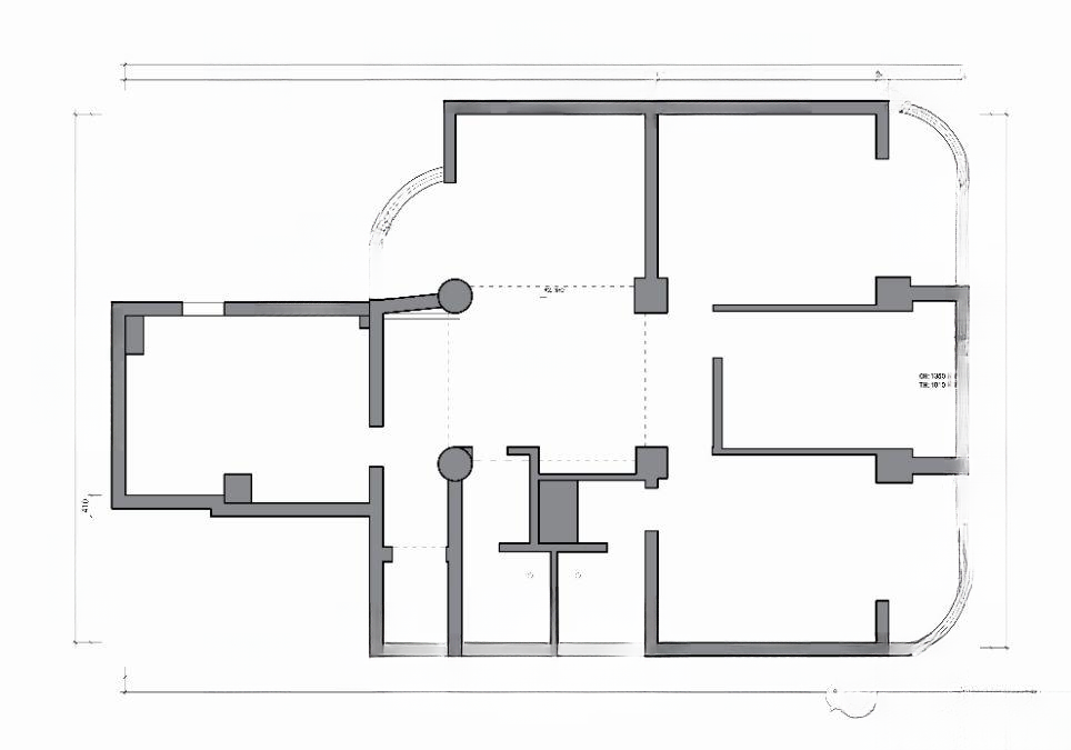
▲ Original floor plan. The house has obvious shortcomings. There are a total of 6 large pillars that cannot be moved or removed. There are great limitations for renovation. The kitchen is super large, almost larger than the bedroom; the living room is infinitely small, almost smaller than the bedroom. The main bathroom directly opposite the living room corridor has been reduced to leave a sunken area, which is not beautiful and makes the bathroom very small.
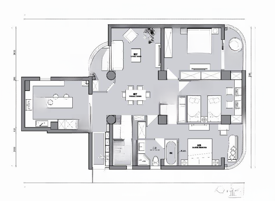
▲After the designer’s unremitting efforts, the final design drawings were finally finalized.
1. Squeeze a shoe cabinet into the aisle when entering the house. Because the aisle is very long, there is no way to put the shoe cabinet inside, which makes it extremely inconvenient to enter the house.
2. At the same time, the living room is too small and the balcony is on the side of the sofa, so the balcony space is expanded, the entrance position is rearranged, and a complete sofa area is freed up.
3. Sacrifice part of the second bedroom space to create a small dressing room in the master bedroom. At the same time, move the main bathroom outward and install the cabinets flush with the guest bathroom.
4. Sacrifice part of the master bedroom space to expand the master bathroom and realize the function of a bathtub
5. Because there are two children, the second bedroom is used as a children's room. Two beds are planned to be placed. According to the position of the pillars, the wall of the second bedroom is moved towards the master bedroom to expand the space of the second bedroom and make it a common room for the two children. At the same time, the wall of the elderly room is sacrificed to make room for wardrobe storage in the children's room. Everything is for the children.
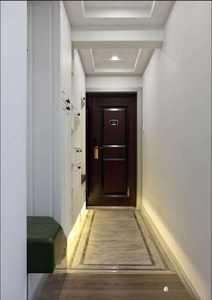
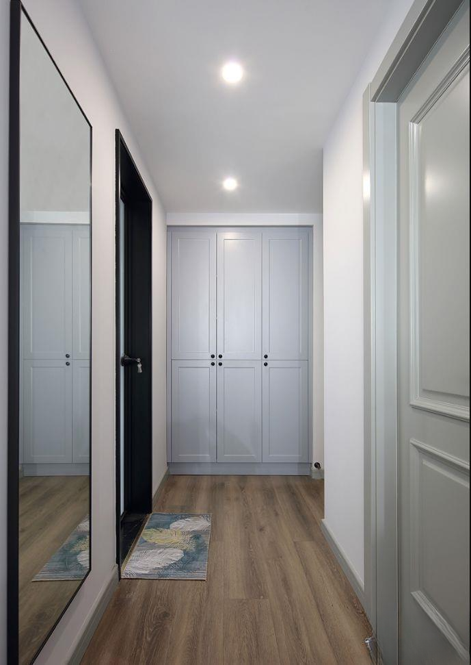
▲Entrance hall, a long and narrow hallway. In order to store the shoe cabinet, a little door frame space was sacrificed. Fortunately, the entrance opens outwards, otherwise the anti-theft door cannot be opened. The final effect is still good overall. The hallway area is paved with stone tiles, dotted with dark gray double-channel waveguide lines, and separated from the wooden floor copper strips in other areas. There is a vacant space in front of the shoe cabinet to the pillar, and a shoe-changing bench area is made. Clothes can be hung directly behind it. All functions are available. The hollow sensor light is arranged under the lower cabinet. It lights up when you open the door at night. It is very useful
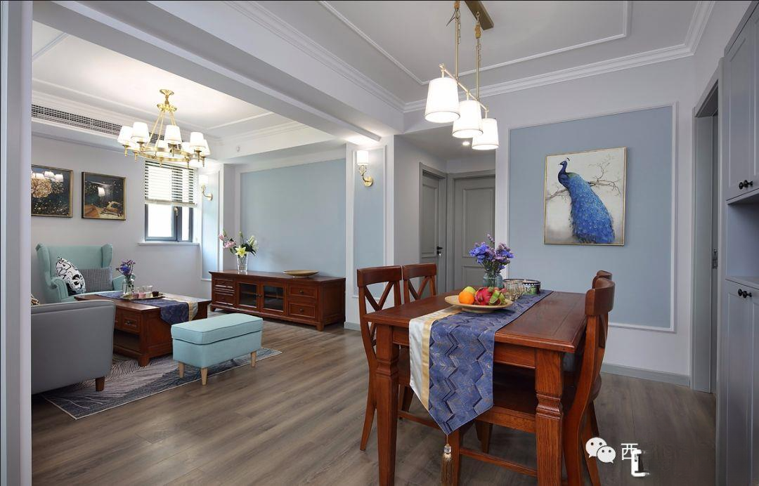
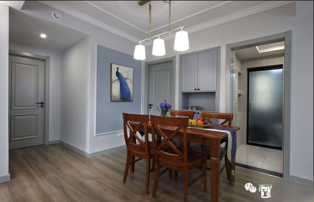
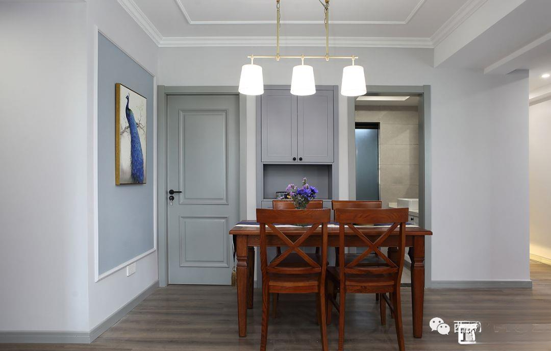
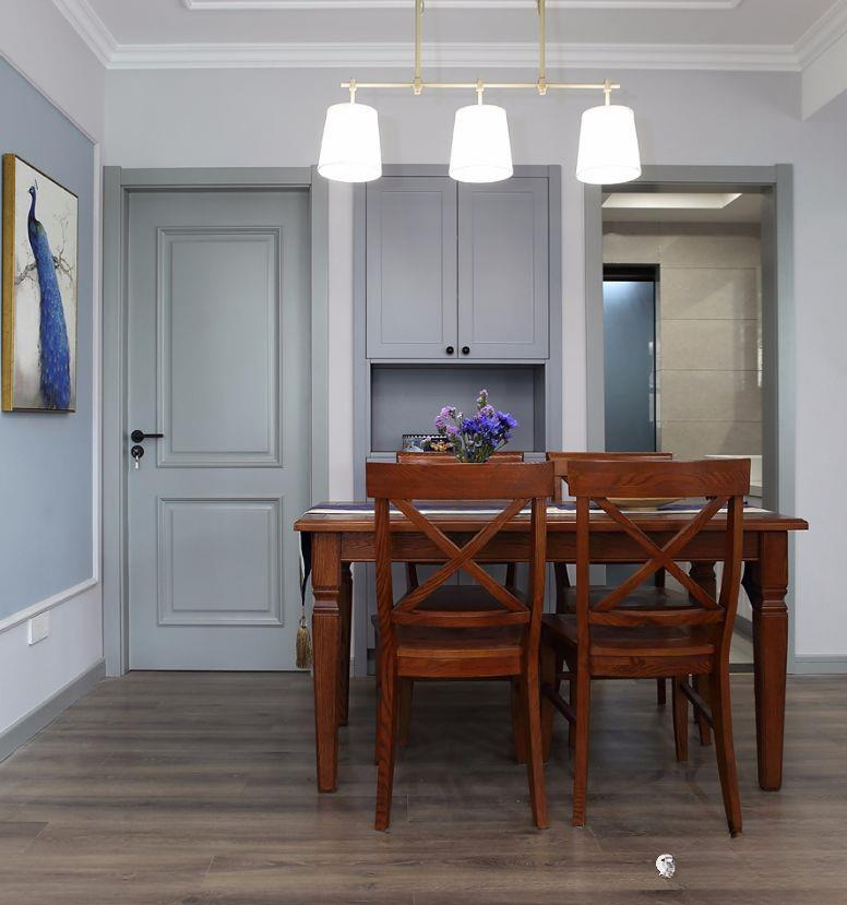
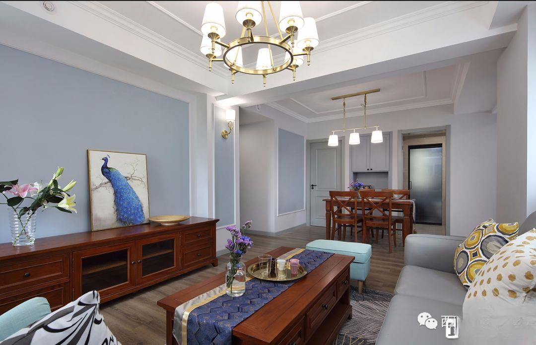
▲Look at the panoramic space from the corner between the foyer and the kitchen. There is really no way to deal with the beams in the living and dining room, so the restaurant basically does not have a ceiling, and is simply outlined with plaster lines and horizontal lines. The TV wall and the restaurant background are outlined with the same lines, and the blue latex paint is refreshing and color-changing
▲The guest bathroom at the entrance hall is long and narrow, so it is separated into dry and wet areas. The Internet celebrity panoramic door in the wet area is very beautiful. Next door is the space leading to the master bedroom. The wall of the master bathroom is used to make a sideboard for storage. The color is the same as the baseboards of the wooden doors in the whole room. It is customized in high-grade gray and is very expensive.
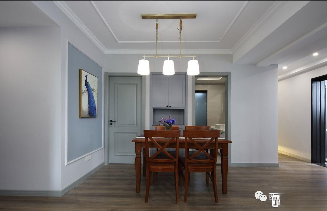
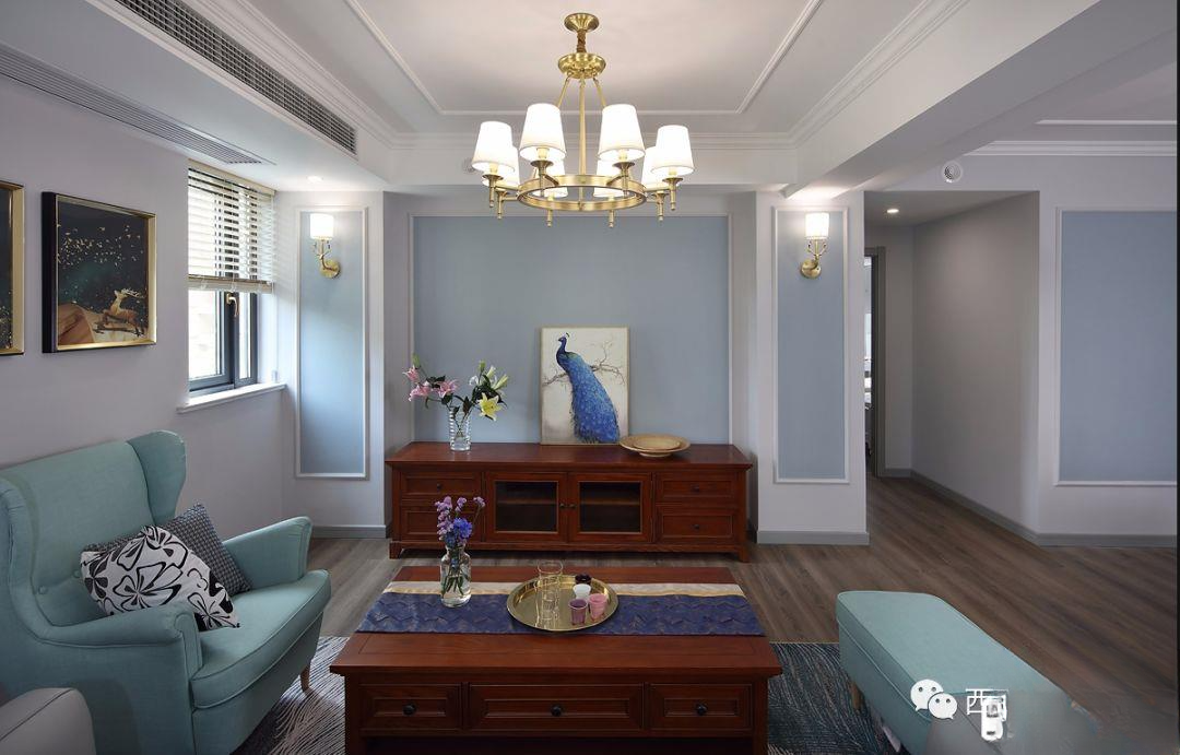
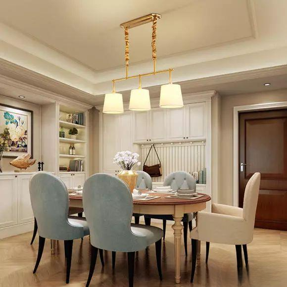
▲ Panoramic view of the lobby and restaurant, with a large area of cold brown color, a partial blue background, and high-grade gray embellishment, the overall look is very fresh. Metal lamps add a high-grade texture
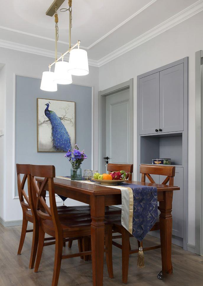
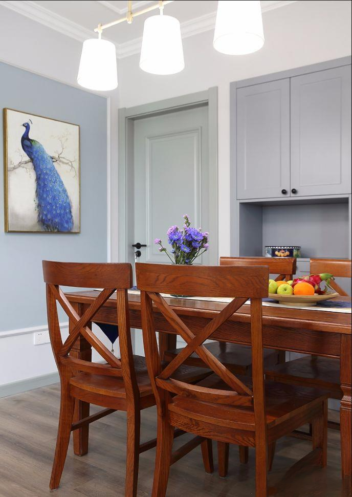
▲ Panoramic view of the restaurant. The dark solid wood dining table is matched with a blue table runner, which is simple and warm. The peacock painting in the background brightens the space
▲Because the wooden door and wardrobe are not from the same manufacturer and are not made of the same material, they cannot be unified. They can only be close in color, but it does not affect the overall effect.
▲Another concern for the dry area of the guest bathroom is that the restaurant is right at the door, so the dry and wet areas are separated to keep the wet area away to avoid embarrassment
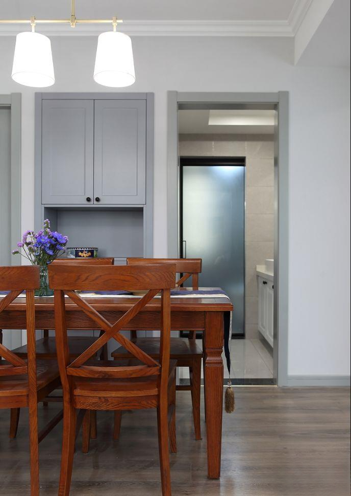
▲Dry and wet separation, unified door cover layout, popular panoramic door, dry area close to the restaurant, it is the most perfect solution
▲The original apartment's restaurant background is not here. The doors of the master bedroom and the second bedroom are next to each other. A cloakroom is designed in the back using the corridor public area, which also happens to create the restaurant background. The bedroom space inside has better privacy.
▲Looking at the guest restaurant from the dry area of the guest bathroom once again proves how wise it is to separate dry and wet areas
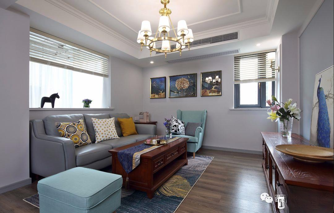
▲Panoramic view of the living room. This is the designer's work. The original balcony was very small, and the door was right where the sofa was, which made it impossible to layout the living room. So the original balcony door was changed into a window, which not only increased the lighting, but also created a better layout. In addition, the balcony space was expanded and the location of the balcony door was changed, which made it more reasonable.
▲The living room is not big, with two windows, one above the sofa and one in the corner. Traditional fabric curtains would cause visual encumbrance and affect the light. So blinds are used uniformly, which is visually clean, and ensures that the living room is always well lit, and can also visually enlarge the space.
▲The original balcony door was changed into a transparent window. At the same time, the stone countertop was customized, and some decorations can be placed on the windowsill.
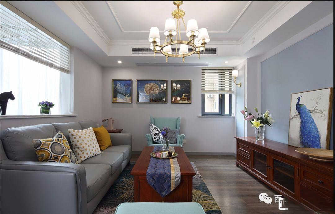
▲Because the space is not big, we don’t want it to be too complicated. There is a big pillar near the aisle on the TV wall, so we made a fake pillar symmetrically in the corner, and outlined it with lines, and changed the color of some parts to blue, which echoed the background of the restaurant, giving a sense of extension visually. The same metal wall lamp is light and luxurious.
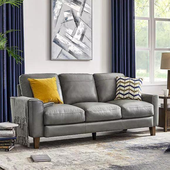
▲The panoramic view of the living room, with a cold brown and blue base, basic American furniture, and a light-colored leather sofa. The overall depth is coordinated and the texture is refreshing
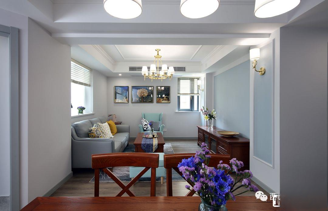
▲Looking at the living room from the dining room, the light is not very dark because all lights are on and it is daytime. On cloudy days, the light is not good.
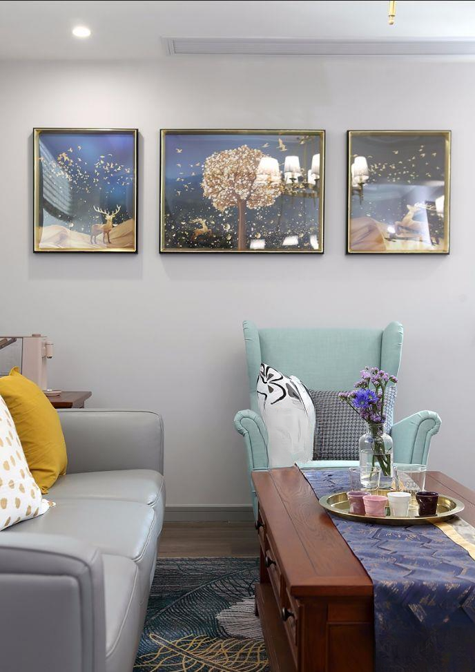
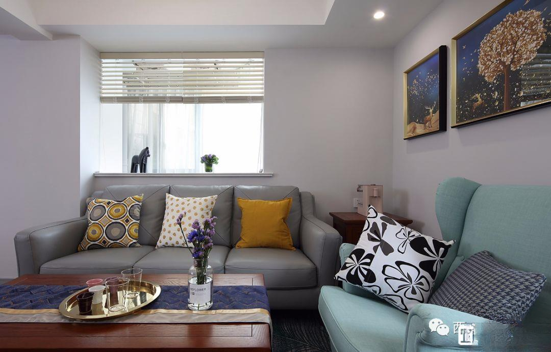
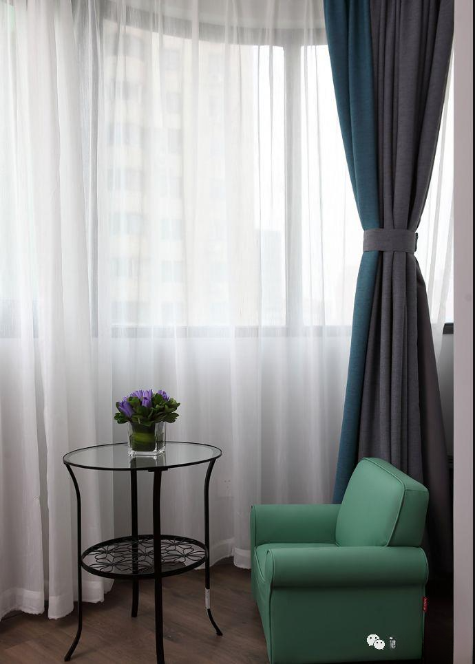
▲The gray leather sofa is paired with a mint green single chair, making the small space look more refreshing and clean
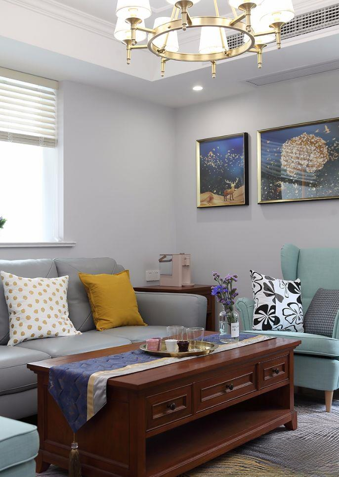
▲The colorful pillows are specially used to decorate the space. The tablecloth for the coffee table was purchased together with the dining table. It looks good, but I don’t know if it will still exist after living there for a while.
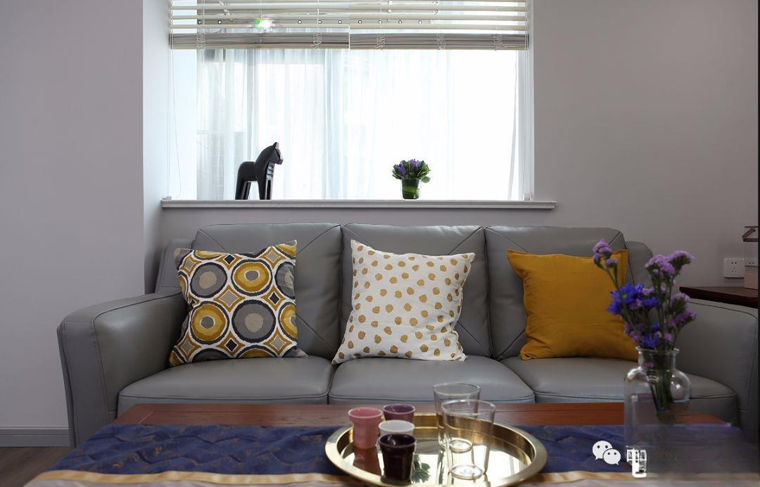
▲ Colorful warm-colored pillows make the gray leather sofa not too cold and enhance the warmth of the living room
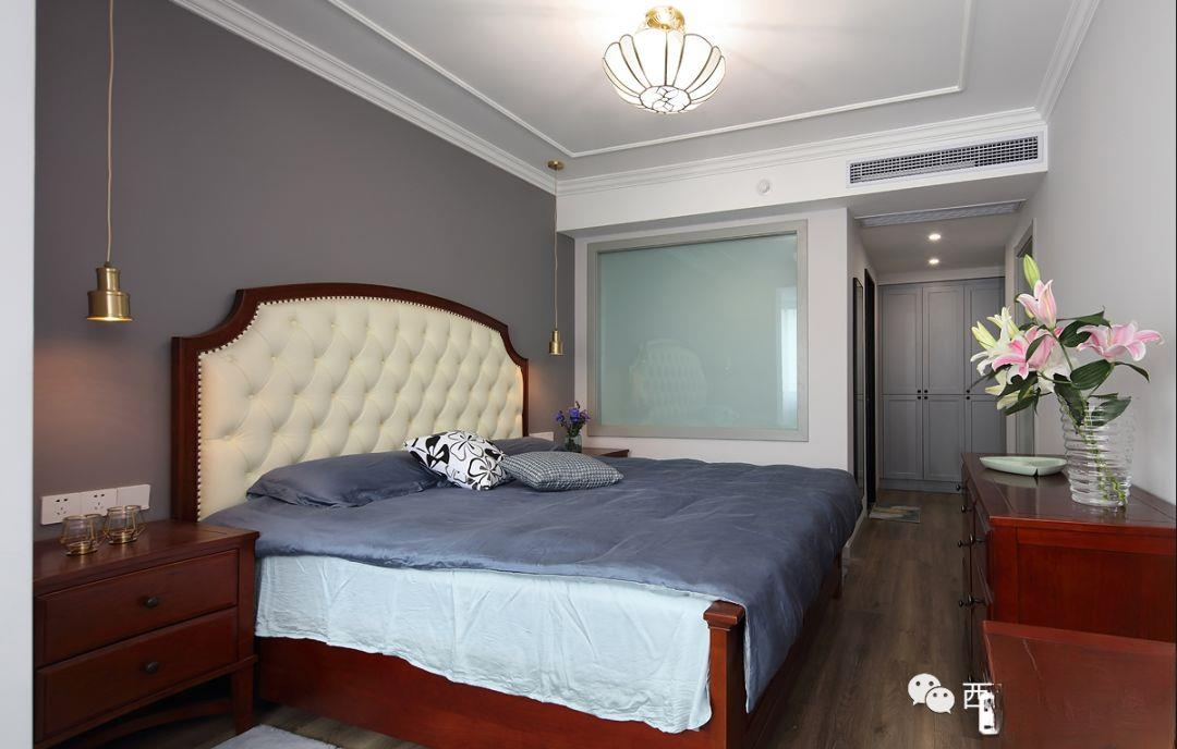
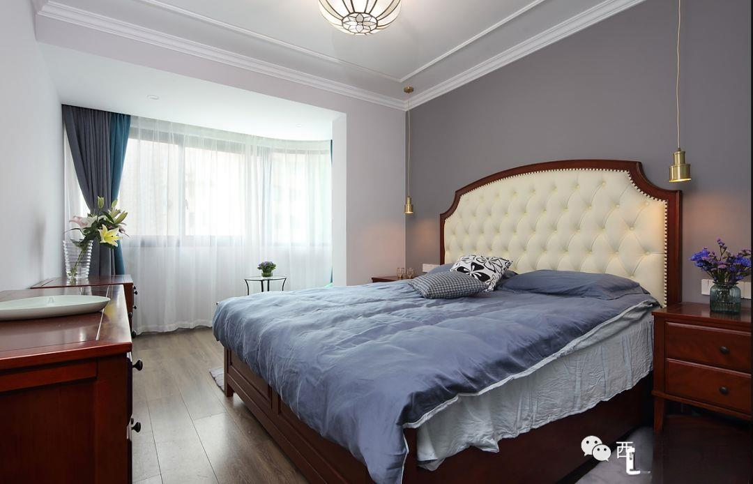
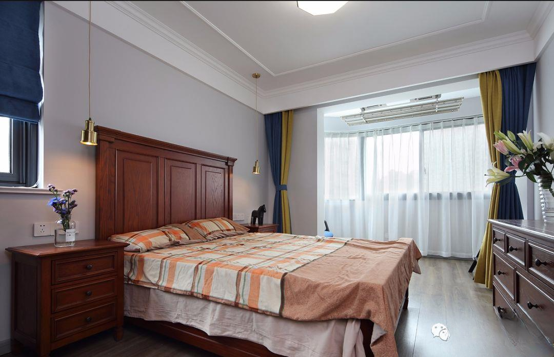
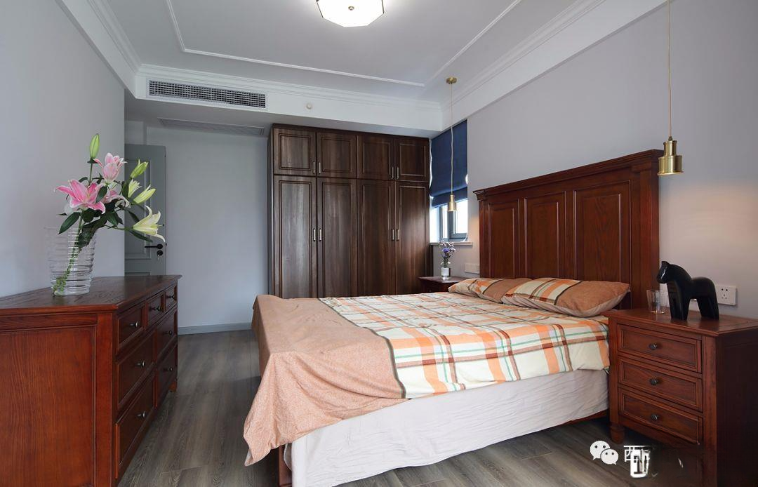
▲The master bedroom is small and has a low ceiling, so except for the air-conditioning ceiling, other simple plaster lines and horizontal lines are used. Because the second bedroom was sacrificed to make the master bedroom cloakroom, more space can be freed up on the side wall. A new glass window was built at the location of the master bathroom bathtub, so that the bathroom has better lighting and the master bedroom can be brighter.
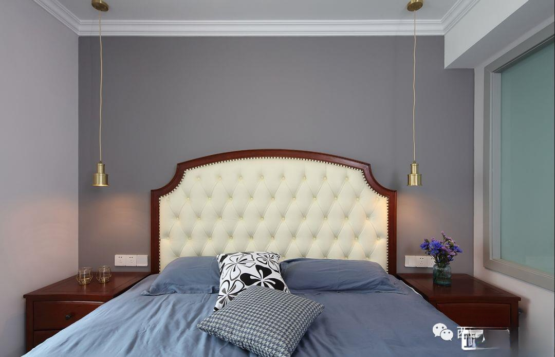
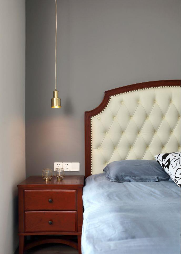
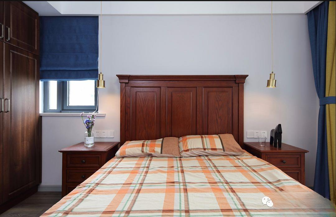
▲The cloakroom frees up the wardrobe space, so it is possible to expand the master bathroom to build a bathtub. The master bedroom space is just enough for the high bed head, and two symmetrical bedside tables are just right. The light luxury golden hanging lights on both sides enhance the sense of space layering
▲There is a big pillar on the left side of the small balcony of the master bedroom, which is shared with the children's room next door. In order to expand the children's room, the wall was moved, the space of the master bedroom was reduced, and the pillar was hidden.
▲The master bedroom has a built-in wardrobe behind the door, and next to it is the black panoramic door of the master bathroom. The full-length mirror in the hallway directly faces the newly built small cloakroom space, which can fully satisfy your storage needs.
▲The green leather sofa and the iron round table on the small balcony of the master bedroom not only achieve the function, but also enhance the grade of the entire bedroom, which is very pleasing to the eye.
▲The background does not need to be hung with paintings. The designer said it is too vulgar and too crowded. The hanging lights are full of high-end feeling and are enough to improve the appearance.
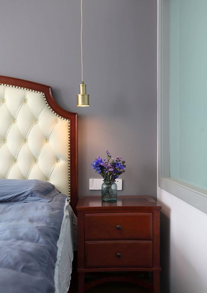
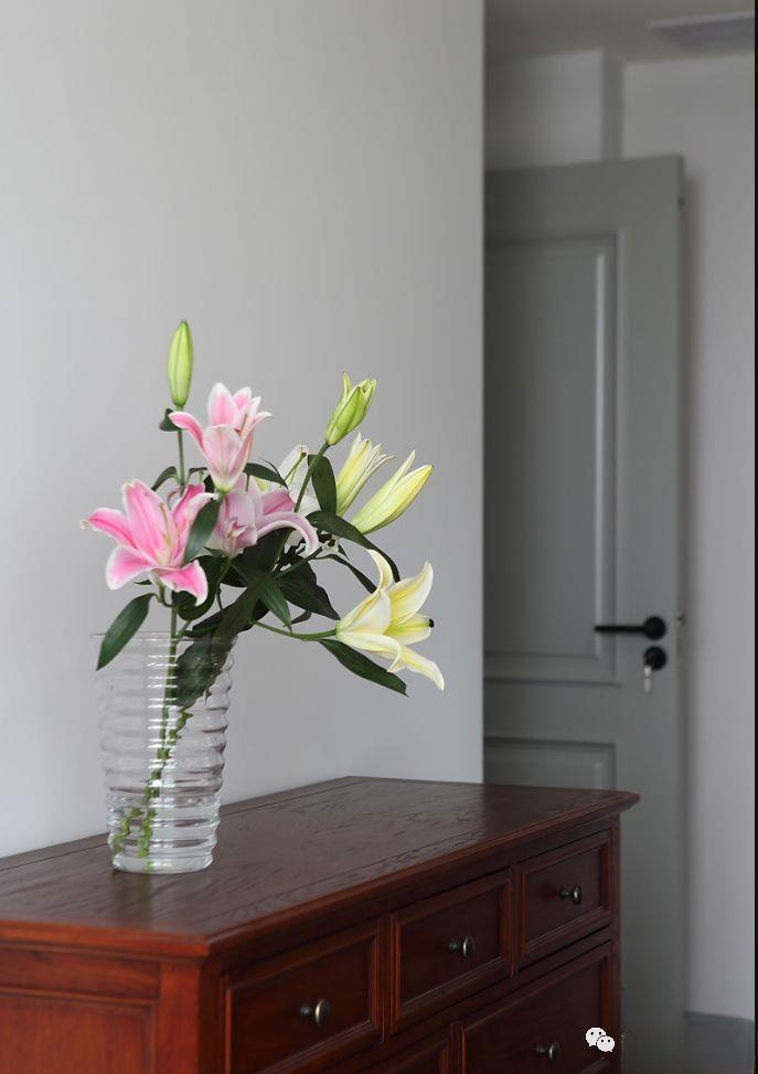
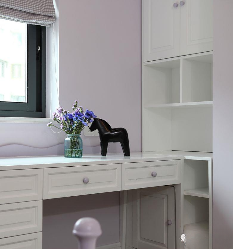
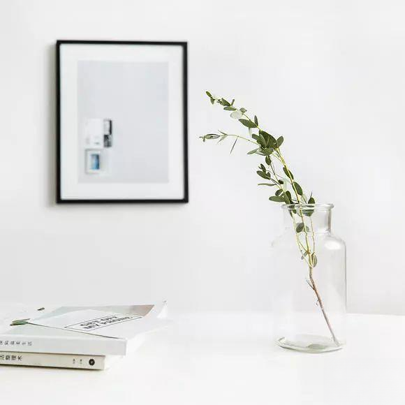
▲The other side also has a golden hanging lamp, and the small and exquisite vase is simple and warm
▲This is the elderly room, with a living balcony, which is more convenient for the elderly to use. In order to free up the wardrobe for the children's room, the span of the elderly room was sacrificed, but the space is enough. The wide edges are made around, which is more complicated and beautiful than ordinary gypsum lines. American classic furniture configuration, two-color curtains make the space brighter
▲From this angle, the space is not large, and the wardrobe is also dark in color, making the elderly room more stable. The uniform golden wall lamps enhance the space
▲Panoramic view of the parents' room, with dark furniture, which is steady and refreshing
▲The matching chest of drawers at the end of the bed is where parents usually put their sundries and medicines, which is quite convenient
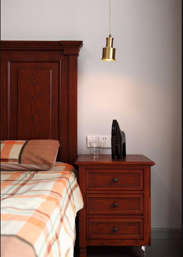
▲A bedside table with strong storage function is a must-have in the parents' room. It is very convenient for the elderly to take things at night. The stylish hanging lamp enhances the grade.
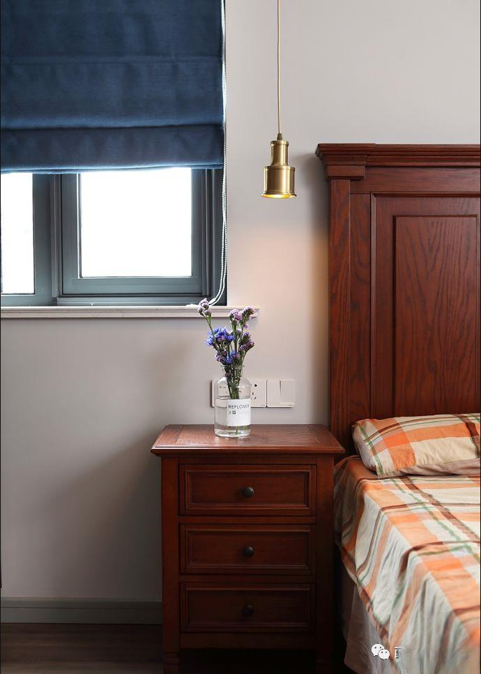
▲The small window on the other side is shaded by a blue roller blind, and the exquisite Nordic vase is a warm decoration
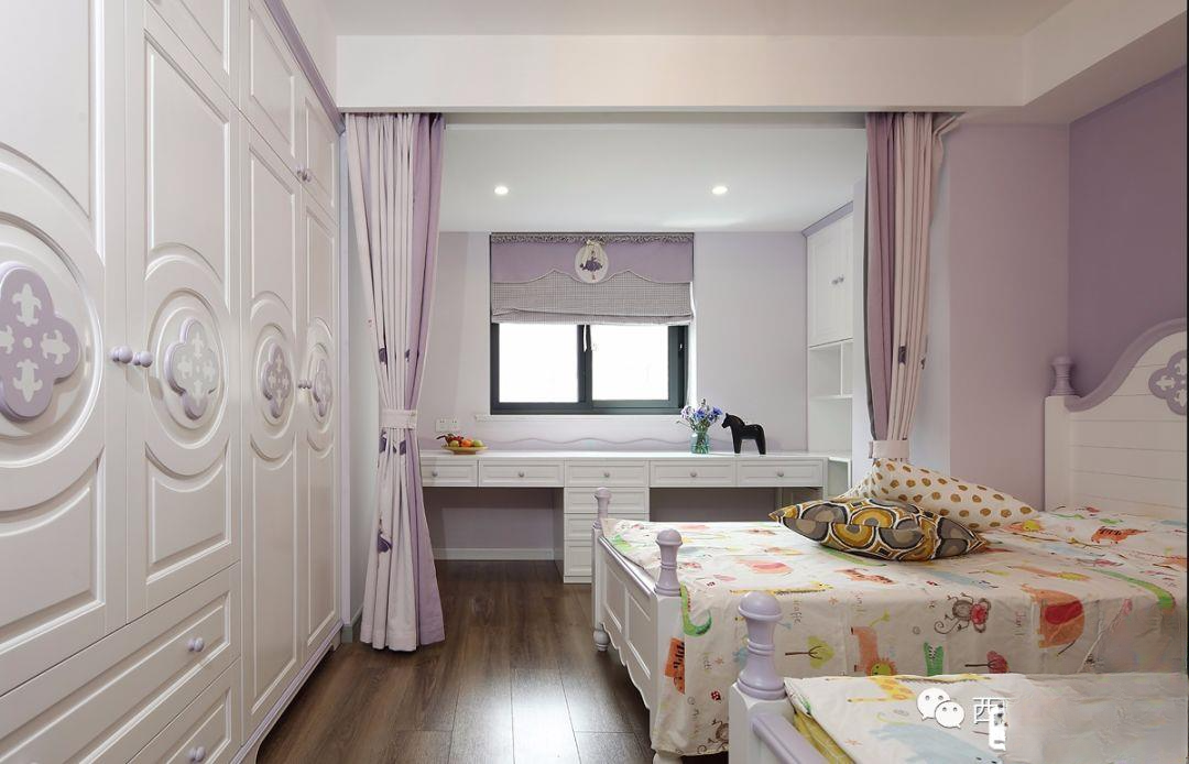
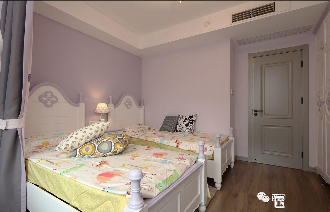
▲The most important children's room, because there are two princesses, two beds are placed side by side, so the balcony is opened up in front and back to expand the space, and the wall is moved left and right to occupy the space. It is really for the children that everything can be sacrificed
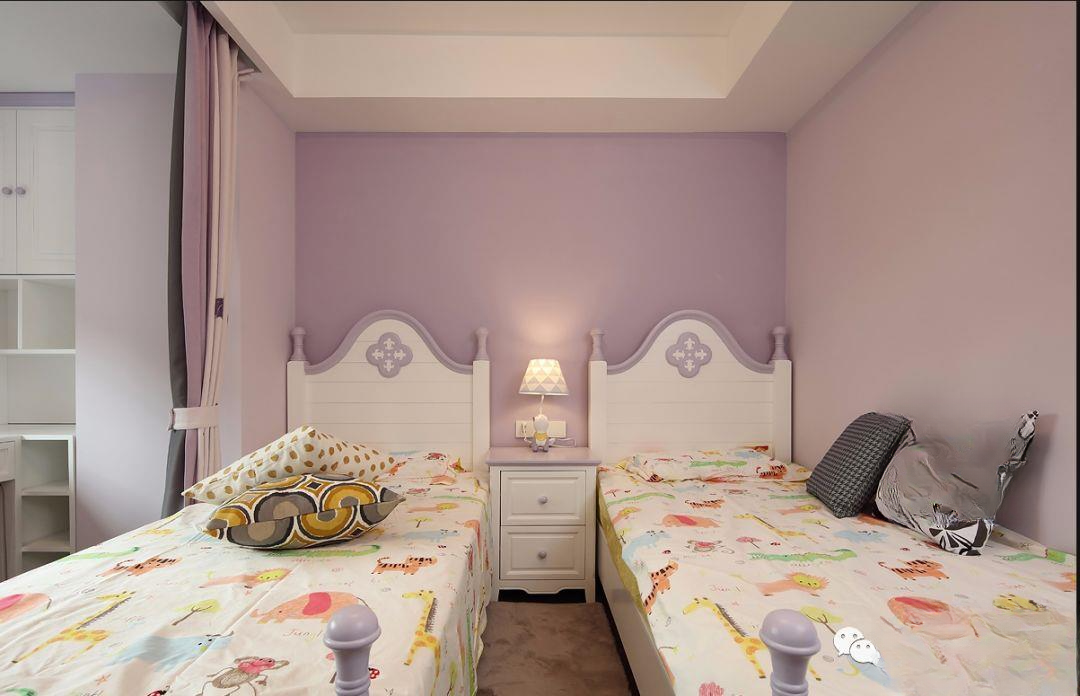
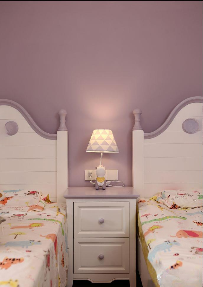
▲The pink color is the favorite of both princesses. Each of them has a small bed of 1.2 meters, separated by a small bedside table in the middle, and they share a table lamp, which is just right for the function.
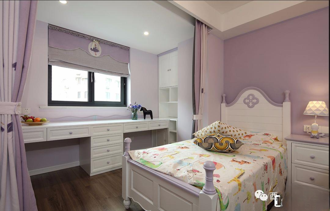
▲The balcony is opened up to expand the space, and a two-person desk is designed by the window, which is more than enough for two princesses to use at the same time. In order to prevent study and sleep from disturbing each other, two curtains are made, one for study and the other for sleep, which can be used to divide
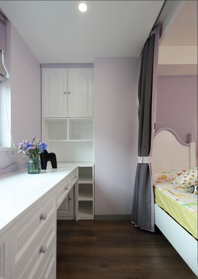
▲The angle of the column is used to make a bookcase for storage. There is also a storage grid below to store various small items for children.
▲Because the master bedroom cloakroom takes up a little space, an irregular space is formed at the door
▲The pink and purple wall is very cozy under the warm light
▲One-piece custom furniture creates more impossible spaces
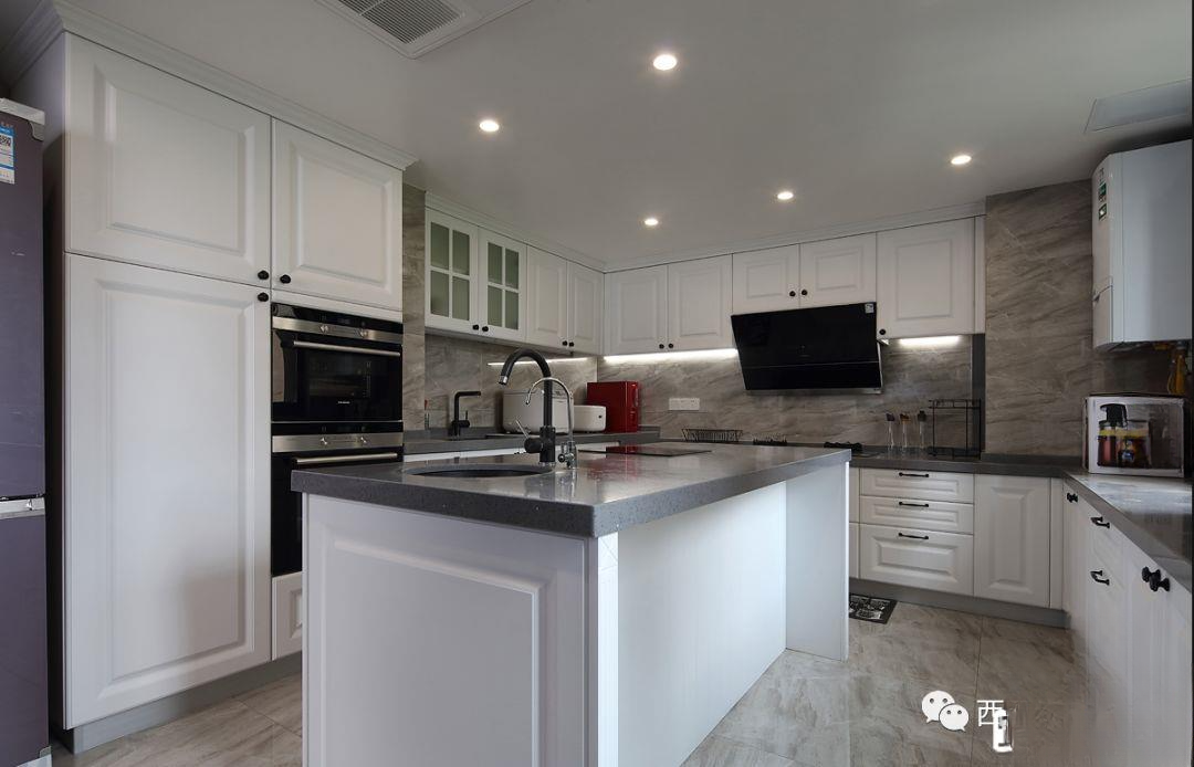
▲The second highlight of this apartment is that the kitchen is almost larger than the bedroom, which is also worth showing off. This is the biggest advantage of a large apartment with three bedrooms. It realizes a super large kitchen and the island space that I have always wanted.
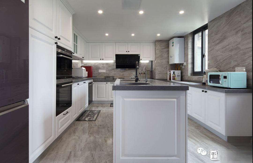
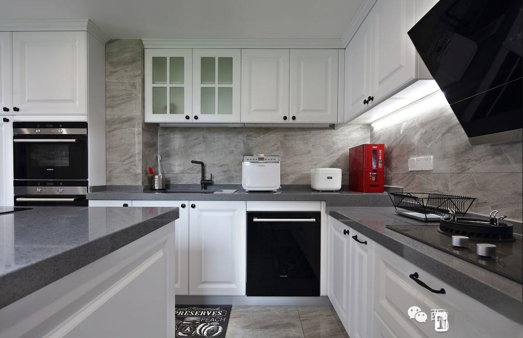
▲The unified and fashionable stone tiles are used for paving, white molded cabinets, and high cabinets are inlaid with appliances and refrigerators. The island adds functionality and improves the appearance, and the space flow is also very spacious.
▲The dark grey countertop is very textured, and the hand-sweep lights in the details create a stronger sense of hierarchy at night
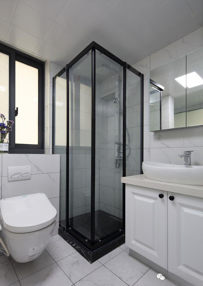
▲The contrast between the white jazz tiles and the black shower room in the master bathroom is very stylish and bright. Customized bathroom cabinets and mirror cabinets are used for storage to ensure a clean and tidy space.
▲The master bathroom itself is very small, so a little space of the master bedroom was sacrificed to create a separate bathtub space. It has both bathing and showering, a small space with great functions
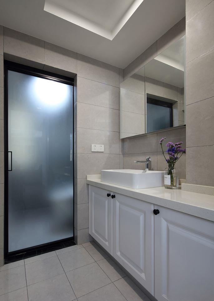
▲The beige tiles in the guest bathroom dry area are matched with a white custom bathroom cabinet. The same mirror cabinet storage keeps the space tidy. The Internet celebrity style panoramic door is very beautiful. The refreshing texture of black and white contrast
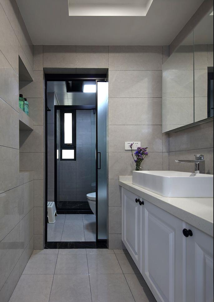
▲A niche is built on the wall opposite the bathroom cabinet to make up for the lack of storage space and make it more flexible and fashionable visually.
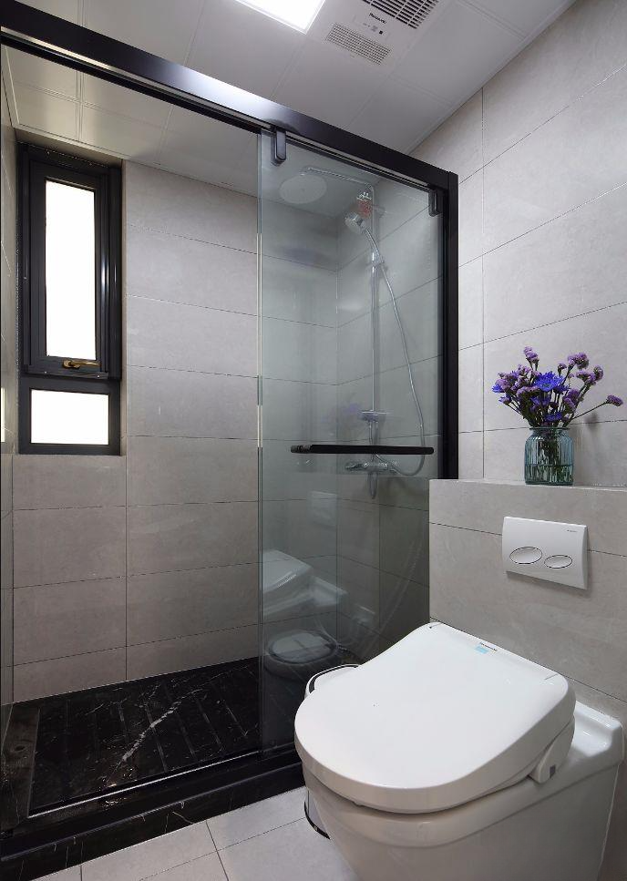
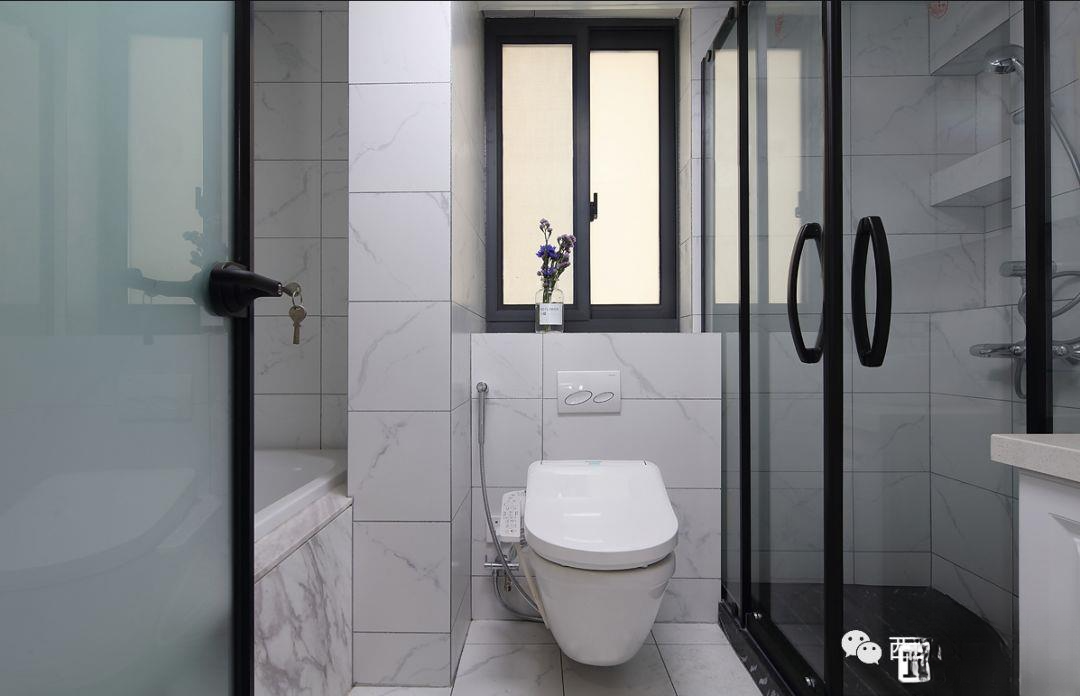
▲The wet area of the guest bathroom is also paved with beige tiles, with a black textured shower partition and a wall-mounted toilet. The shower floor is designed with black stone grooves.
Recommended decoration items in this issue
01
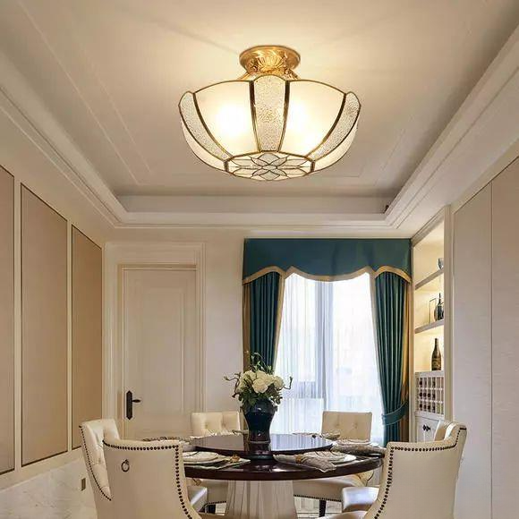
American restaurant chandelier
Click to buy now
▼
02
American leather sofa
Click to buy now
▼
03
Retro transparent vase
Click to buy now
▼
04
American style ceiling lamp
Click to buy now
▼
05
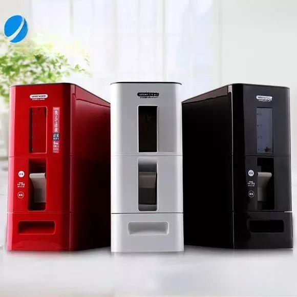
Kitchen rice bucket
Click to buy now
▼

165 square meters of modern mansion Zen, all tiled budget will exceed the budget
165 square meters, four-bedroom European style decoration, warm colors of the house
165 square meters, four-bedroom new Chinese style, this kind of family is loved by everyone
165 square meters American style, the house has its own charm
165 square meters, four-bedroom European style decoration, warm colors of the house