No wonder there are no coffee tables in the living room now! After seeing her 140 square meters home, I realized how comfortable it is
When it comes to the layout of the living room, we know that in traditional design, the "old three" are indispensable. Only in this way can it be called a complete living room. However, as life becomes simpler and simpler, the layout of the living room is also constantly changing. For example, canceling the conventional TV wall design is a very typical example.
Another example is that removing the coffee table is becoming more and more popular. In this case, the owner of the house has abandoned the TV wall and coffee table. Although it seems a bit unreasonable, you will know how comfortable it is only after trying it.
Plan structure diagram
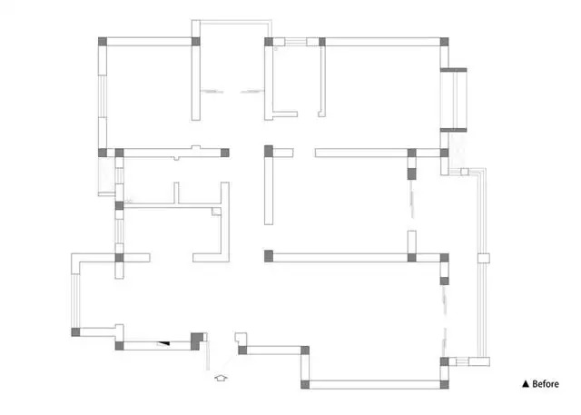
The new house is located in Nanjing, with a construction area of 140 square meters, four bedrooms, two living rooms and two bathrooms. Unlike ordinary families, the owner and his wife have no special requirements for the new home, they just hope to have a comfortable and relaxing space atmosphere, and their acceptance ability is relatively high.
From the original apartment structure, although the space is relatively large, it is too trivial to divide, which makes the space feel crowded. Therefore, in order to create a comfortable and transparent space, some corresponding adjustments were made to the whole.
Floor plan
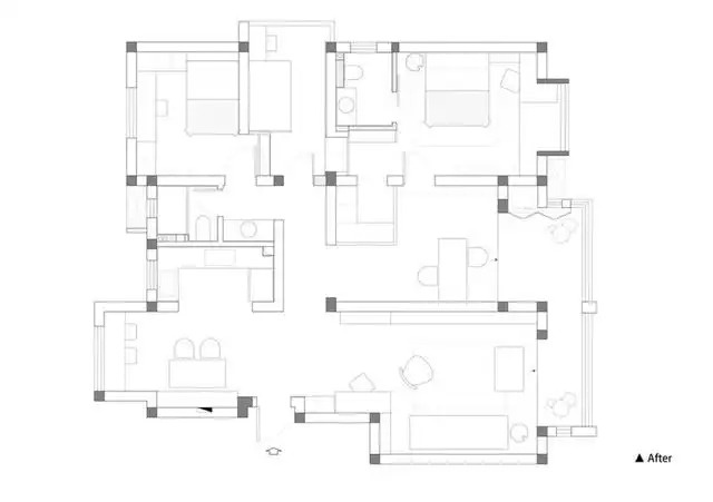
The space layout is transformed as follows
1. The kitchen adopts an open design and incorporates the north balcony into the dining room to expand the sense of space.
2. Enlarge the study doorway and adopt a two-way traffic line design. At the same time, set aside part of the space for the master bedroom and extend it into a cloakroom.
3. Adjust the position of the guest room doorway to make full use of the area of the children's room.
4. The door opening of the main bathroom is adjusted to the side to further expand the area of the cloakroom.
living room
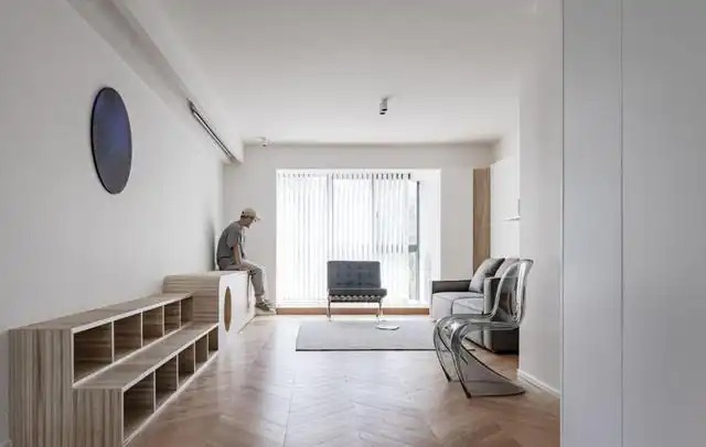
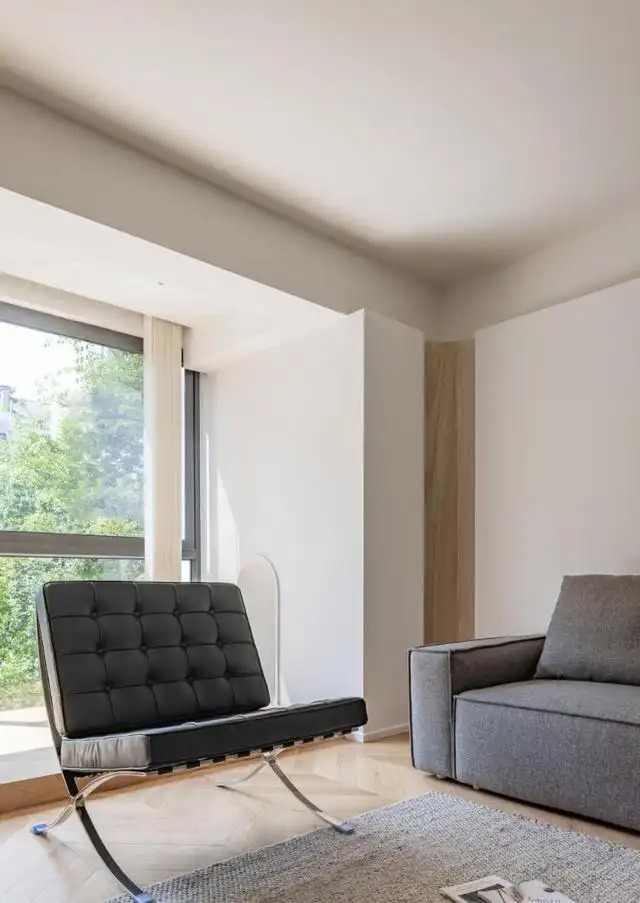
Considering that the public area of this apartment is not very spacious, the entrance area gave up the independent entrance partition design to maximize the sense of space. The shoe cabinet is designed in the recessed space on the right side of the entrance door. The cabinet body is all the way to the top and the door handle is removed, which is both simple and neat and improves the utilization rate of the cabinet body.
The living room abandons the traditional TV wall design and adds a set of functional low cabinets, which not only visually reduces the complexity of the space, but also combines display and storage functions. At the same time, it can also be used as a cat climbing frame, giving pets a free activity area. Of course, the electric curtain hidden inside the ceiling also retains basic audio-visual functions.
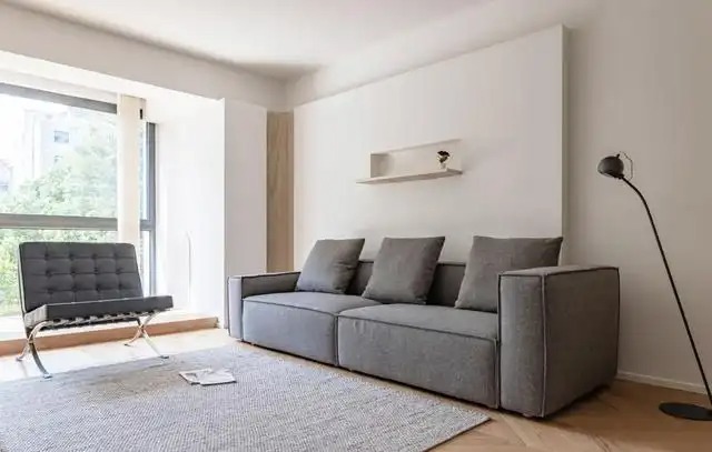
In addition to simplifying the TV wall, the entire living room also eliminated the coffee table in terms of furniture configuration. This not only makes the space more simple and neat, but also an oversized carpet gives the space more changes, thus truly realizing a relaxed and leisurely lifestyle.
Perhaps many people think that not having a coffee table in the living room will have some impact on life. But in fact, if you can be self-disciplined in life, you don’t need to use a coffee table to solve your daily storage needs. On the contrary, it will increase the sense of clutter in the space.
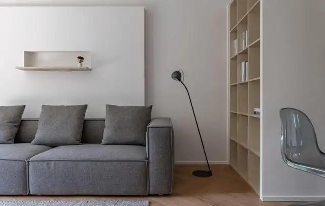
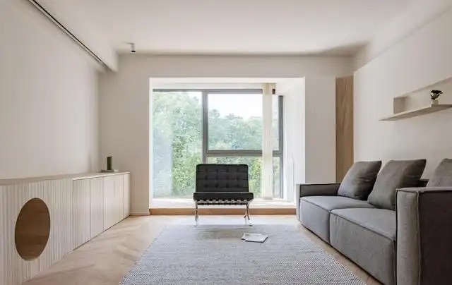
In order to make the transition between the living room and the balcony more natural, the sofa wall is designed in a modular shape, and the corner is rounded to cleverly weaken the abruptness of the structure. The open bookshelf design on the side also provides storage and convenience for reading.
balcony
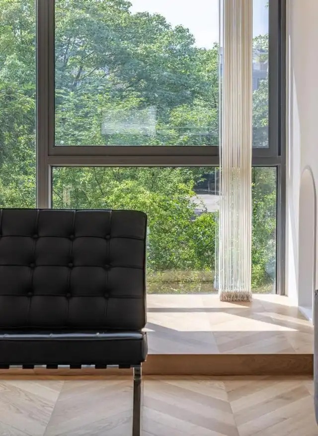
The entire balcony floor has been raised, and matched with panoramic floor-to-ceiling glass windows, which not only shows the comfortable and lazy lifestyle to the fullest, but also shows the vitality.
From the study room looking toward the balcony, the small doorway designed for cats gives the pets a private space. The balcony is equipped with vertical blinds with excellent drape, which creates a hazy light and shadow for the room under the refraction of sunlight.
Dining room
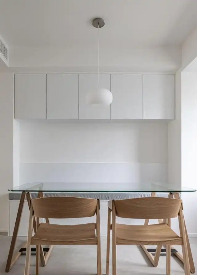
Considering that there is a sunken space on the side of the restaurant, the booth is directly used for layout, which not only saves space, but also solves the storage needs of the restaurant. At the same time, it also blocks the strong and weak electricity boxes on the wall, making the space more tidy and beautiful.
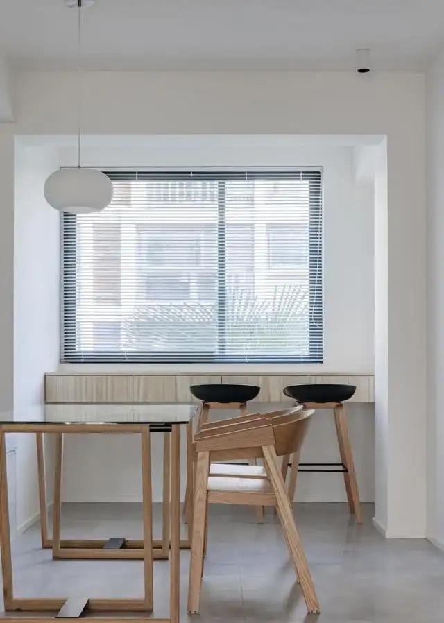
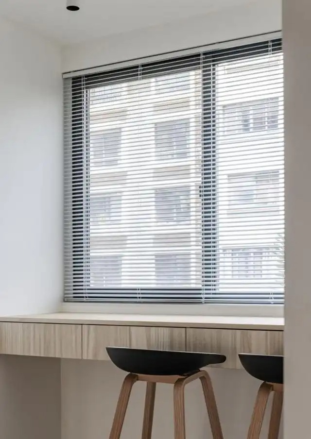
When the north balcony is incorporated into the restaurant, in addition to expanding the space area, the drawer cabinet designed by the window also serves as a small bar. This makes it very convenient for daily leisure, handicrafts, and office work.
kitchen
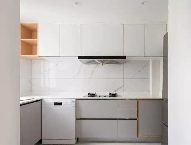
The kitchen is designed in an open style, which once again helps to free up the sense of space. The cabinets are arranged in a U-shape and are positioned in pure gray and white tones, which is both simple and high-end.
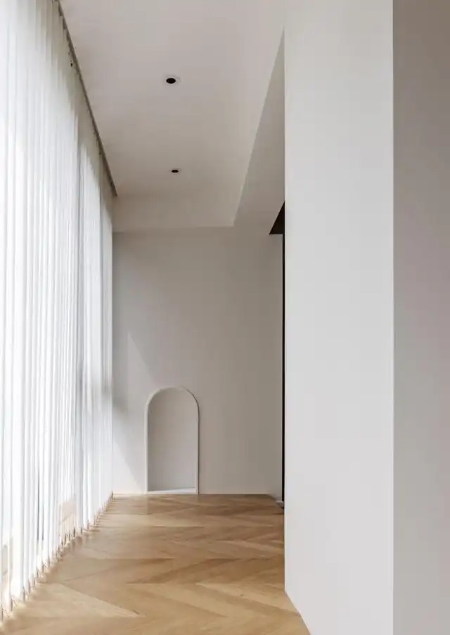
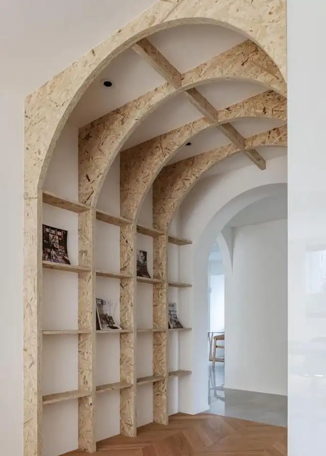
aisle
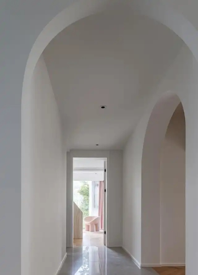
The corridor design is very detailed. In addition to the arched design of the doorway, the door of the children's room is also made to reach the ceiling, thereby maximizing the visual height.
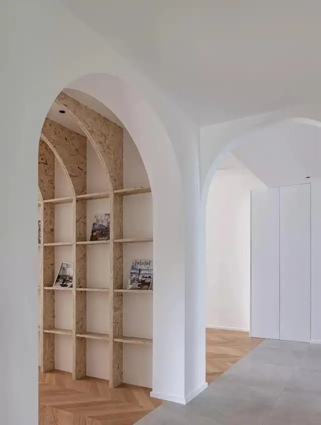
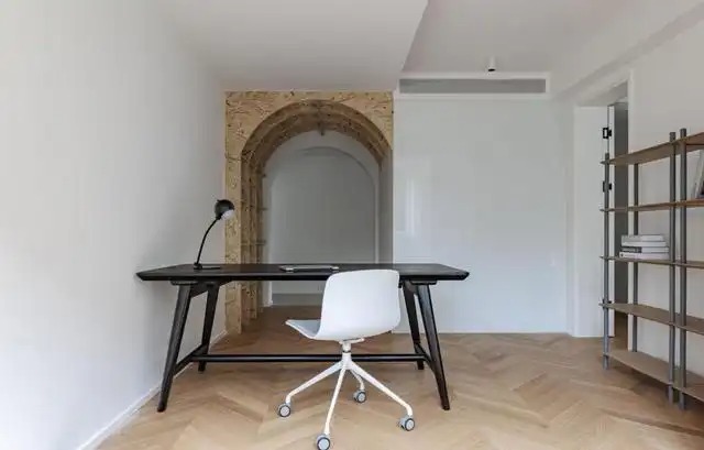
study
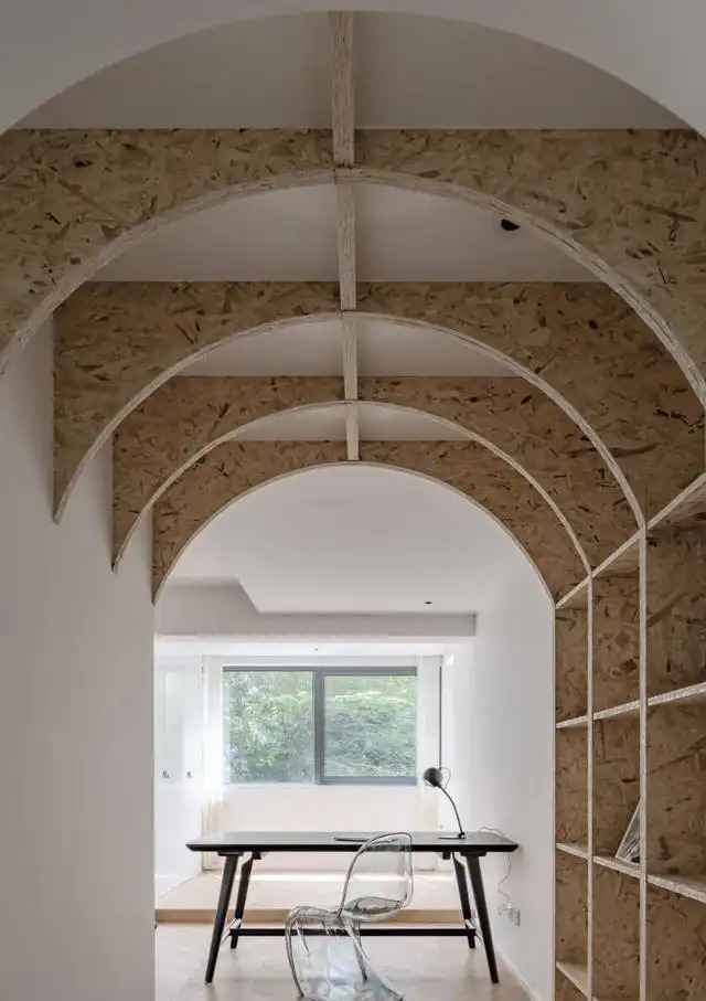
After the door opening of the study was enlarged, an arched doorway was also designed to echo the corridor. In addition, the arched bookshelf design in the corridor of the study is also a highlight of the space. In particular, the rough and simple European pine board veneer retains the most original texture in the simple tone.
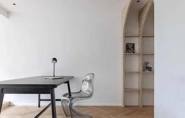
The study room is not overly decorated. A black desk and a gray Panton chair not only echo the modern fashion elements, but also easily capture the visual focus.
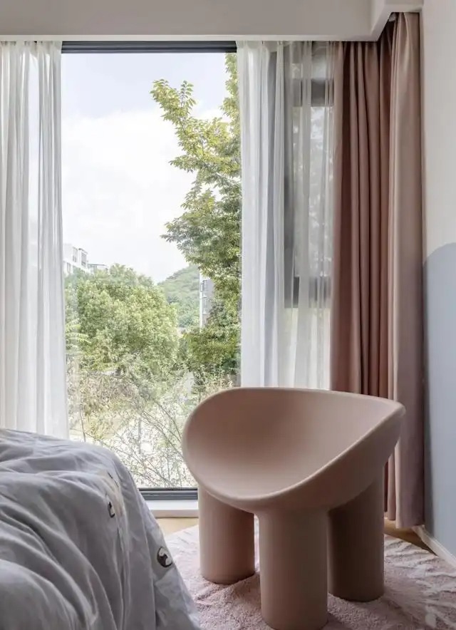
Master Bedroom
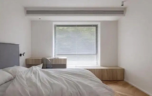
The master bedroom continues the tone of the outside, creating a high-quality sleeping space in the simplest and purest way. The bay window cabinet and desk designed by the window also meet different usage functions.
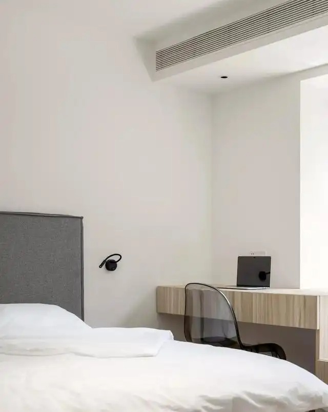
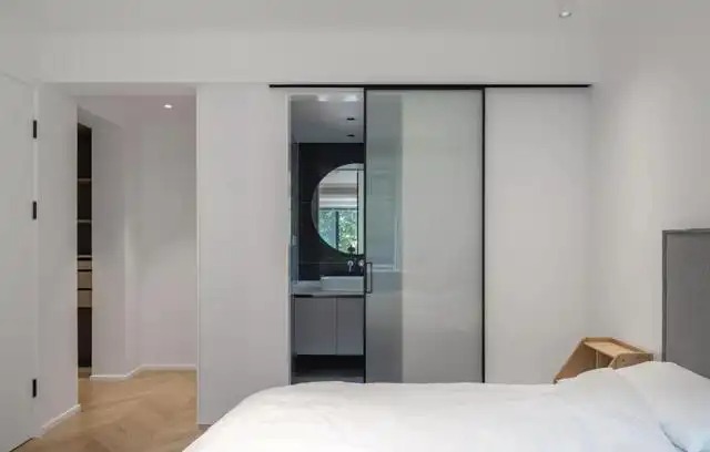
Since the door opening of the master bedroom was adjusted to the study, and the door opening of the bathroom was adjusted to the side, the small aisle area at the original entrance was fully utilized, and the storage capacity of the cloakroom was expanded.
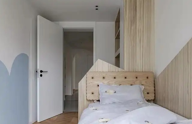
Children's Room
The children's room is based on low-saturation pink and blue, and the interspersed wood elements give the space a lively atmosphere without losing warmth. The presence of the entire floor-to-ceiling glass window also brings a touch of green vitality to the space.
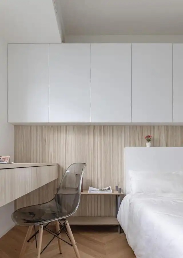
Second bedroom
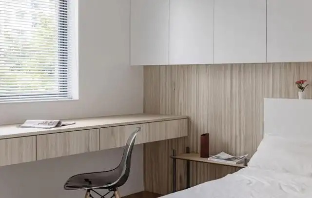
Since the second bedroom is less used, its layout is more functional. For example, a desk designed by the window, an integrated bedside and wall cabinets, etc. This way, even if no one lives there, there will be no invisible waste.
Looking at the whole case, the biggest highlight is that the layout of the living room is changed to restore the space performance of the apartment. Especially when the study adopts a two-way traffic line design, it makes the whole space more flexible. So you might as well try it when decorating.
Image source: Design by Jian