Flower Arranging Skills | Pay attention to these two points, color matching and appearance aesthetic rules
Western flower arrangement generally follows certain rules to create a pleasing work. Today, let’s talk about how to use “rules” to create good Western flower art works from the aspects of color and shape.
Color: Pay attention to the color matching of flower arrangement
For floral design, color matching is a key point of visual presentation. Comfortable color matching can make the flower arrangement refreshing!
Please remember this mantra!
Basic color primer,
The main color determines the style.
Add finishing touches with accent colors.
Three types of colors have their own functions
Base color: 70%
The basic color is the main flower color, which accounts for the largest proportion in the entire bouquet and determines the overall impression left by the bouquet.
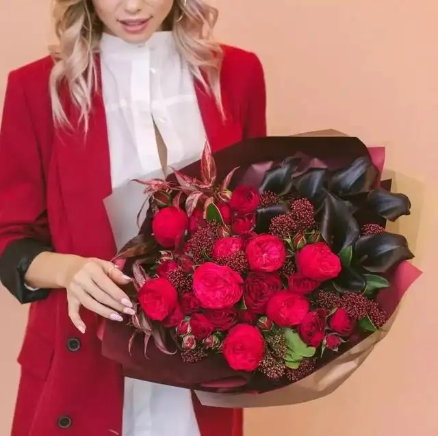
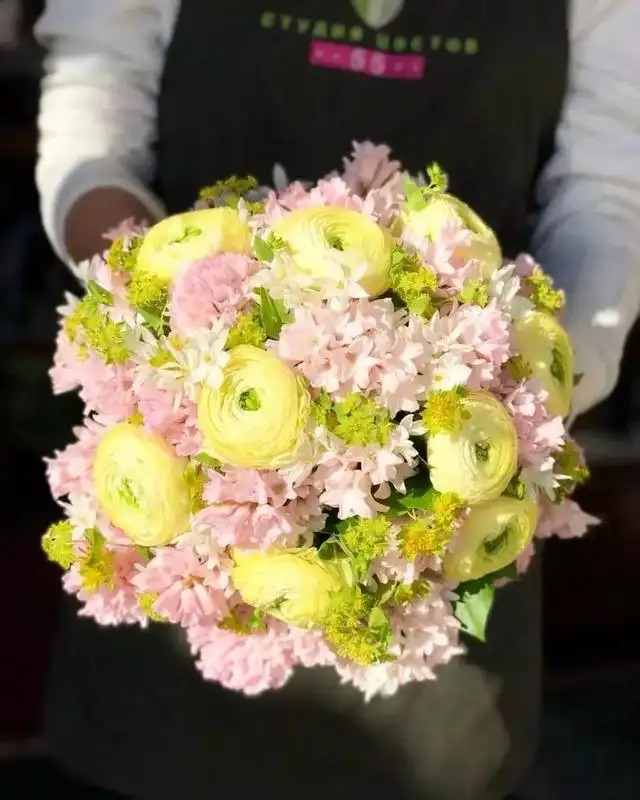
The main color is pink, which makes people feel soft and happy.
The main color is purple-red, giving people a feeling of elegance and mystery.
Main color: 25%
Another name for it is harmonizing color, which is the approximate proportion of the basic color. Its combination with the basic color determines the main style of the bouquet.
You don't need to worry about controlling the color proportion of the large flowers, just create different levels of depth.
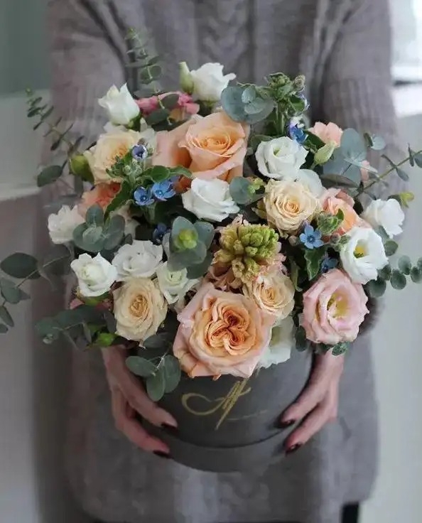
The base pink + main orange , with gradients of varying shades, give the bouquet a very layered feel.
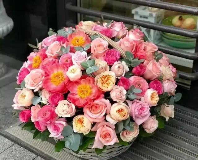
Basic pink + primary green is a very common color combination in nature, harmonious and energetic.
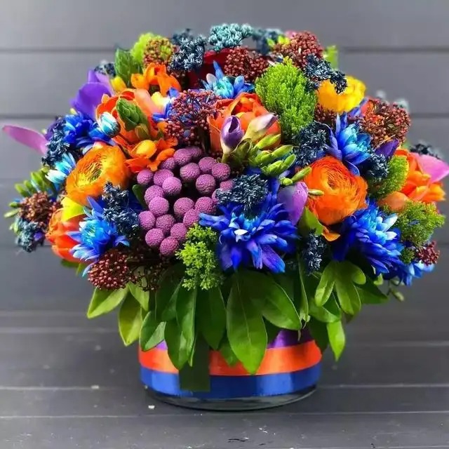
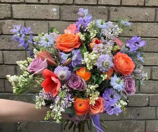
The main color and the basic color are complementary colors, such as red and green, orange and blue, yellow and purple . This will produce a strong visual impact. This color combination is brighter and more lively than a single gradient of light and dark colors. This is also a commonly used flower matching technique in Western flower art.
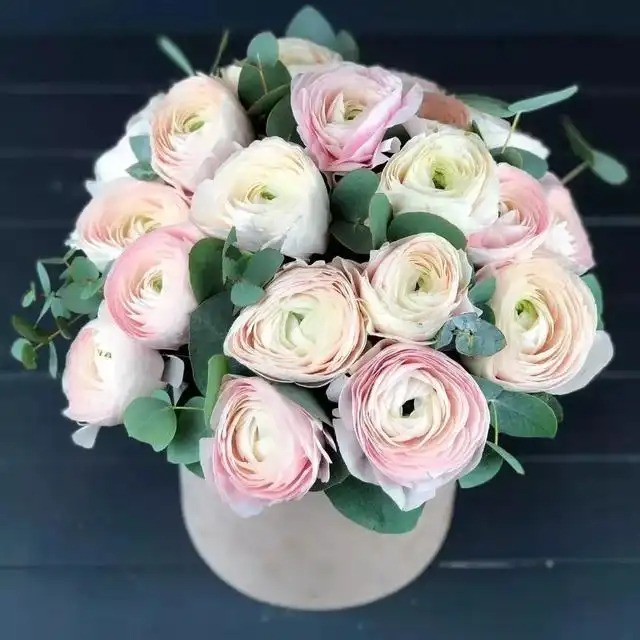
Basic purple pink + main light yellow . Although the color layers are rich, the color of the entire work gives people a very harmonious feeling because of the similar color saturation.
Basic purple + main orange . Although orange is more eye-catching, the purple is more flamboyant. By combining the two, the whole work is balanced.
Accent color: 5%
Although it takes up very little space, it is the eye of the entire bouquet.
The basic pink and white + the main orange are both warm tones, so the accent color is a cooler purple.
The basic pale pink and purple + the main white are both cool tones, and the accent color is a warm red.
Appearance: Focus on aesthetic principles : unity and change, symmetry and balance
1. Unity and Change
The law of the unity of opposites is the most basic law of dialectical materialism. Unity and change are the application of the law of the unity of opposites in design and modeling, and are the most basic laws of aesthetic principles.
Floral design is an organic combination of three-dimensional elements such as points, lines and surfaces, virtual and real space, color, texture and other elements into a whole.
Specifically in floral design, unity is the search for the inner connection, commonality or shared characteristics between flowers, vases, shapes and spaces. Variation is the search for the differences between the various parts. Without unity, the floral design will be chaotic, lacking harmony and order. Without variation, the work will be monotonous and lack vitality.
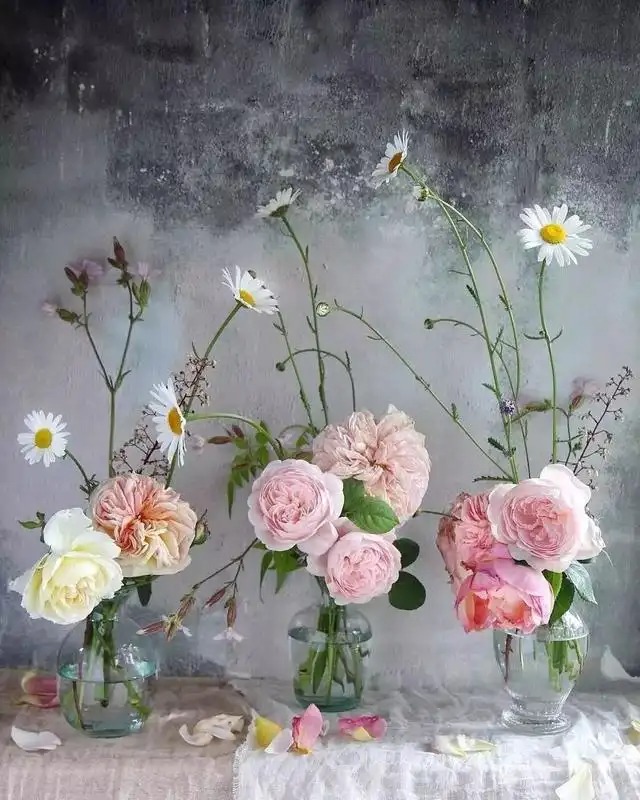
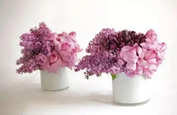
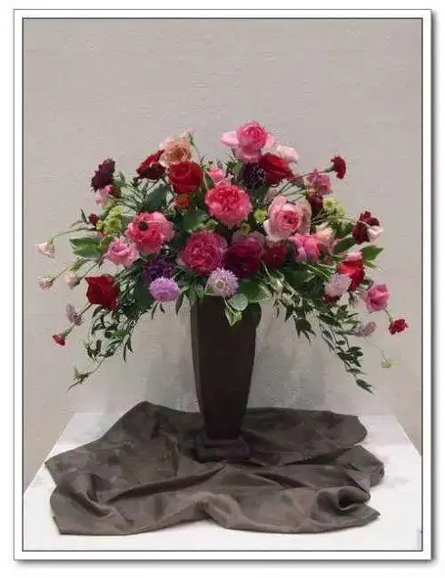
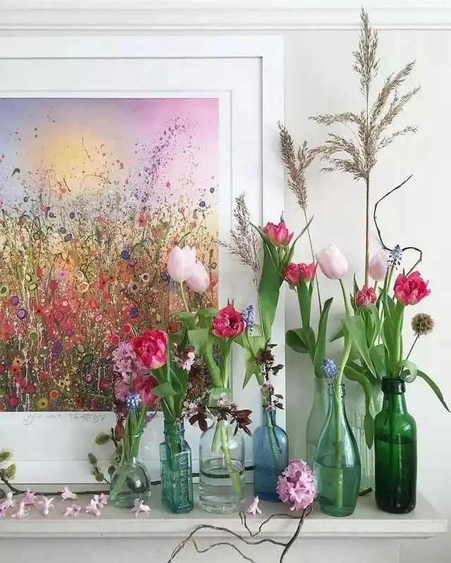
As shown in the following figure, the unified color of the work is purple , but the color is composed of dark purple tulips, lavender lilacs and pink roses. The changes in color saturation and brightness bring a sense of layering to the work.
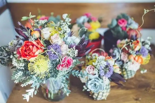
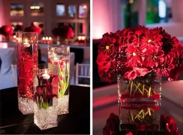
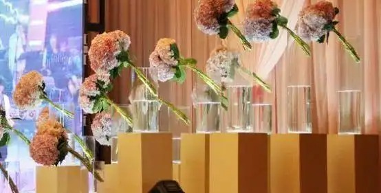
Look at the picture below. This is a set of table flower arrangements. Each of the following works uses different flowers, shapes, and heights, but each work uses red elements and uses brown vases. This is a small unity in a big change.
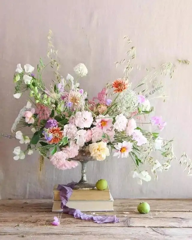
In floral design, the aesthetic principle of unity and variation is basically implemented by using colors, flowers, vases, shapes, etc. For example, in the following picture, in the table flower design for the dinner party, the colors are unified, while the flowers, shapes, and vases are varied.
2. Symmetry and balance
Symmetry and balance are one of the laws of aesthetics . People have a sense of balance. For example, when watching an acrobat walking on a tightrope, when he loses his balance a little, people will feel uncomfortable, and even unconsciously tilt their body or twist their mouth. This is a way for people to maintain their sense of balance. Similarly, when people see an unbalanced composition, they will experience this imbalance through automatic analogy. It is for this reason that people need a balanced composition. This is also true in flower art creation.
Symmetry is the most basic form of balance. Symmetry can achieve a good visual balance, form a beautiful order, give people a static beauty, orderly beauty, and make people feel solemn, serious, generous and perfect. For example, the human body, Tiananmen Tower, and Zhongshan suit are all symmetrical forms. In Western classical flower art, hemispheres, triangles, and fans are all perfect presentations of symmetrical forms.
Symmetrical floral works are usually used in more serious and solemn occasions or spaces. For example, the Palace of Versailles in France, Buckingham Palace in the UK, and the Forbidden City in China, which symbolize royal power, all adopt strict symmetrical forms. However, symmetrical forms can easily give people a dull, monotonous, and uninteresting feeling. Therefore, floral designers can use the law of "unity and change" that I talked about before to create asymmetrical but balanced works.
Balance is a form of balance between the forces on both sides of the fulcrum. This is the law of mechanics followed by static objects in nature. When it comes to balance in flower art, it is specifically reflected in the balance of flower vases, flower materials, shapes, textures, colors, etc.
For example, in the picture below: For example, in a bouquet, the large flowers are at the bottom, and smaller flower buds are used to create a sense of jumping, which is a kind of visual balance of weight.
For example, in the picture below, the hydrangeas are inserted diagonally, but a thicker glass vase is used and half a bottle of clean water is added. It can be seen that the hydrangeas are not immersed in the water. This actually uses the actual weight and visual weight of the thick vase and water to create a sense of balance.
Flower arrangement still requires a lot of practice.