95m² one room for two people, three meals a day, four seasons, Nordic mix
The decoration is beautiful and tasteful, without any fancy shapes or even plaster lines. Although it is positioned as Nordic, it is only the mainstream, and other elements that I like are mixed and matched. The final effect is surprisingly satisfactory.
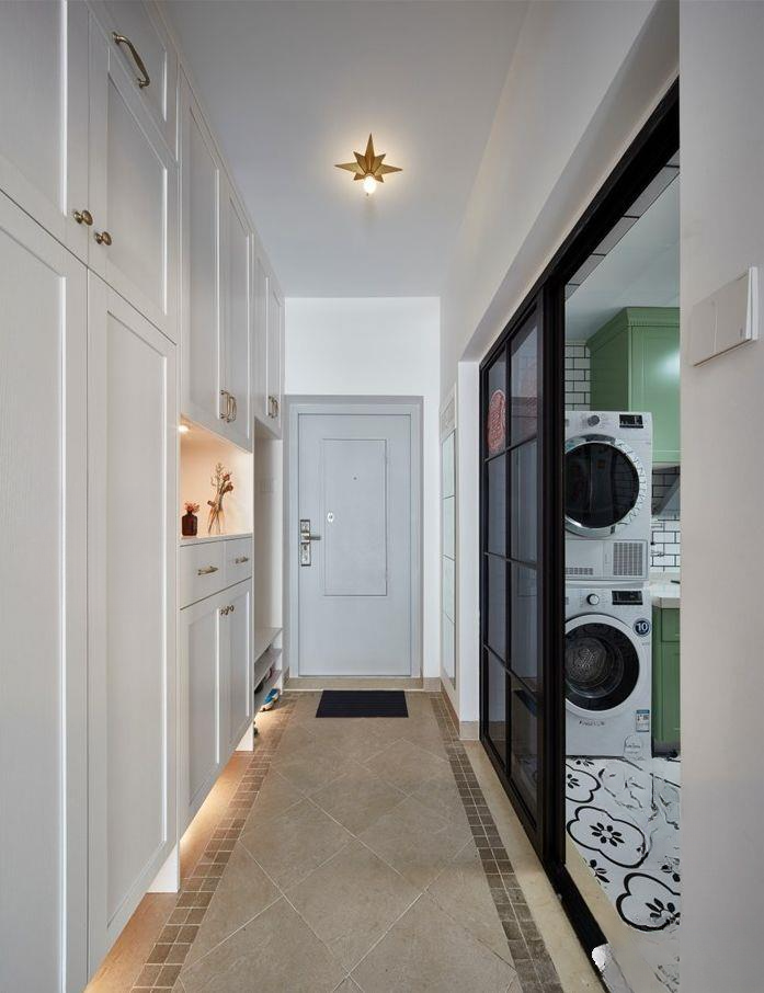
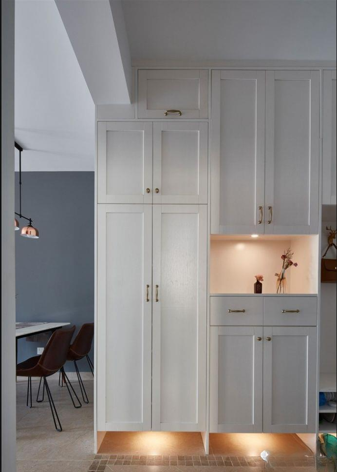
▲The entrance hall is long and narrow, and a storage cabinet and shoe cabinet are built on the right hand side. There is a shoe-changing bench near the door and a partial hollowing out for placing items at the entrance. The bottom of the storage cabinet is uniformly hollowed out, one is to place shoes at the entrance, and the other is designed with an induction light, so that there is no need to turn on the light when entering the door at night, the induction light will light up automatically, which is very convenient.
The full-length mirror at the kitchen door on the left side of the entrance meets the function. The kitchen uses a black metal door texture, which echoes the black and white tiles on the floor. The foyer is decorated with antique brick diamond mosaics and waveguide lines.
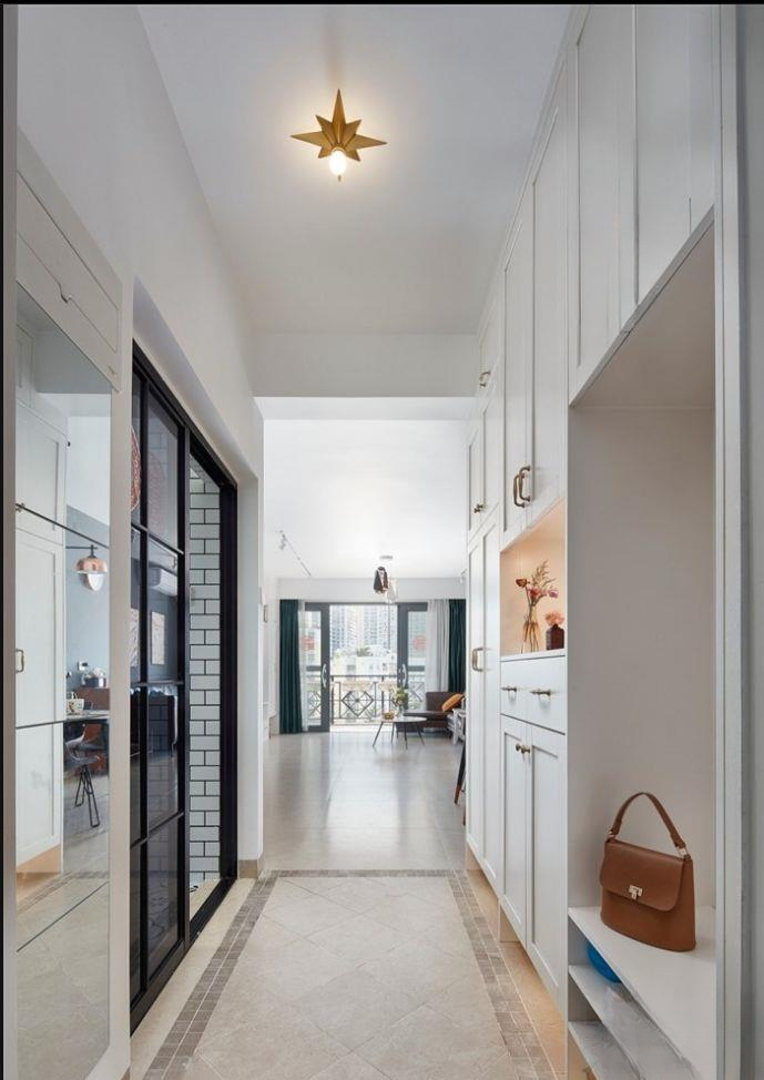
▲The foyer has a panoramic view, and you can see the living room balcony at a glance. The minimalist and luxurious five-pointed star lamp is matched
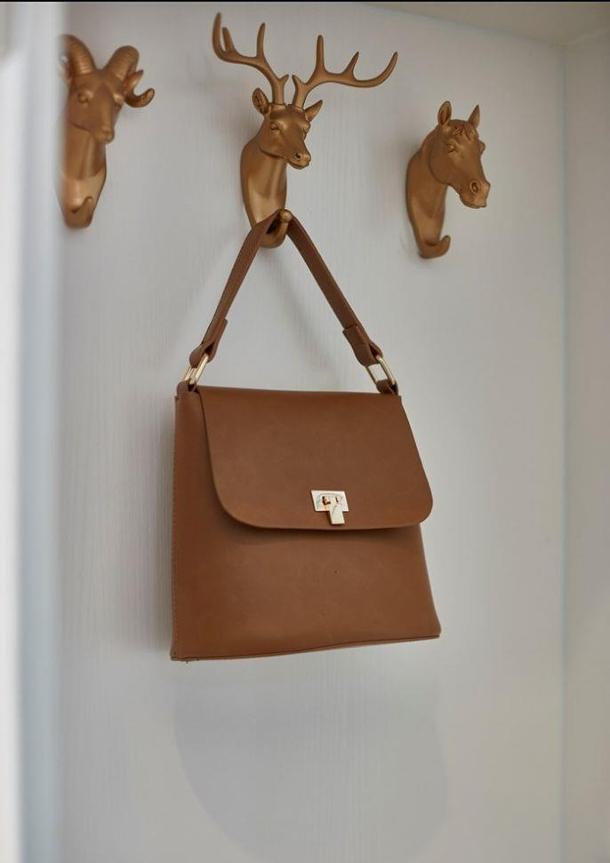
▲The metal animal hooks on the background of the shoe-changing bench are very novel
▲There is no ceiling in the hallway, so the storage cabinet is flush with the beam, so it can only be made into an L-shape. Fortunately, it is difficult to notice if you don't pay attention.
Many people do not distinguish between the primary and secondary aspects of decoration, and insist on blocking a so-called entrance hall in the hallway. If this apartment is placed directly opposite the balcony because it is not good to see the balcony when entering the door, the whole layout will be ruined.
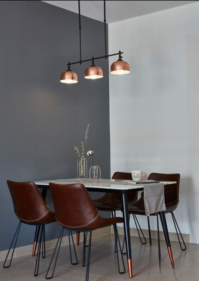
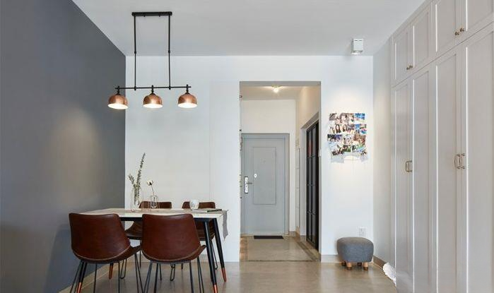
▲The dining room is in the right corner of the hallway. A simple Nordic stone dining table is matched with four leather dining chairs, and a minimalist metal chandelier echoes it. It is very simple, and the background wall uses color-changing contrast to enhance the texture of the space.
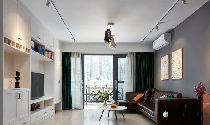
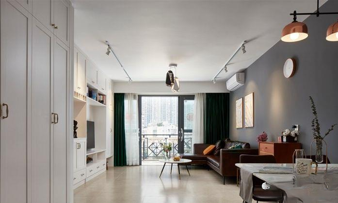
▲Full view of the living room, with minimalist pendant lamps and track lamps for local lighting. The leather sofa is matched with a minimalist round table. The TV wall is made of storage cabinets. The functions are fully utilized without any unnecessary shapes.
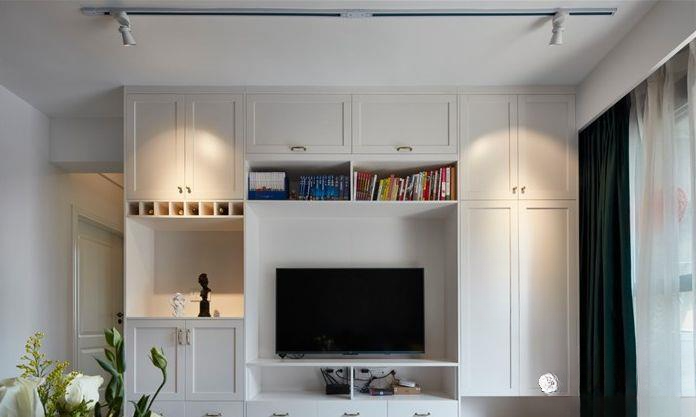
▲No extra shapes, full functionality, the TV wall is mainly used for storage. It also has the functions of storage cabinet, bookcase and wine cabinet
▲Look at the panoramic view, white and blue-gray contrast. The longest wall changes color to visually extend the space [suitable for small apartments, long wall changes color to extend the space 9.11] Other functional arrangements are not cumbersome, minimalist and clean
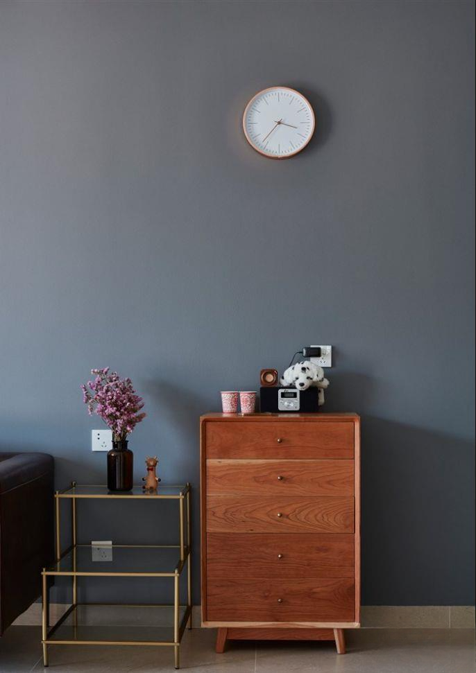
▲Between the sofa and the dining table, a wooden chest of drawers and a metal glass side table are paired, combining cold and warm, and the warmth of wood and the toughness of metal are coordinated
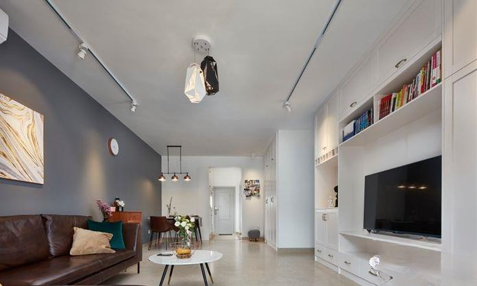
▲Stand in the hallway and look at the whole view. There are many storage cabinets, all of which are made of solid wood and multi-layer. The cabinet doors are molded. Solid wood is too expensive.
▲The wall opposite the restaurant is also a storage cabinet, with a small shoe cabinet in the corner. It was given to me by the merchant when I bought the furniture. I have no place to put it, so I put it in the corner as decoration temporarily.
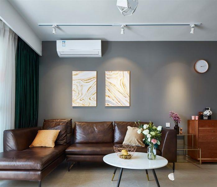
▲The leather sofa is L-shaped, and the low style can stretch the height, which is very harmonious with the low round table. The hanging painting is a warm-colored abstract style that is randomly selected, which contrasts with the cold-colored wall, making the three-dimensional effect stronger.
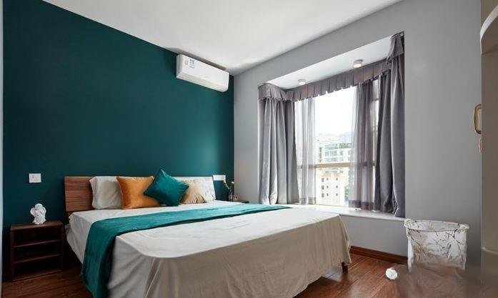
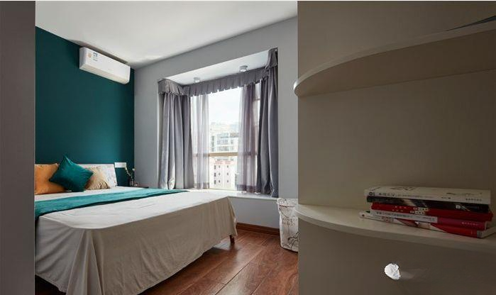
▲The bedroom is also minimalist, but the background is dark green, which is darker. It is matched with wooden furniture. It is minimalist and has texture.
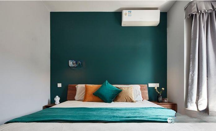
▲There is no problem with lighting, so the dark green color does not seem to affect the light. On the contrary, it contrasts with the white wall, which is very layered and has a strong three-dimensional effect. It is also the most satisfactory effect
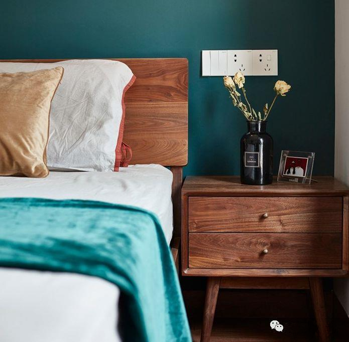
▲The little brown bottle is a popular model. The dried flowers were picked up from the community and they fit in perfectly. If you need a vase, you can click here to buy it.
▲The master bedroom has a small horizontal space, so we can only build a storage wardrobe opposite the bed.
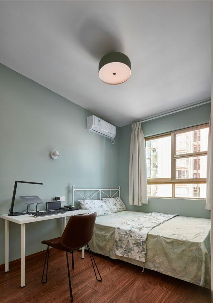
▲The second bedroom is temporarily used as a guest room. The simple iron bed and desk are from IKEA. The wall is painted in mint green, which looks refreshing and warm.
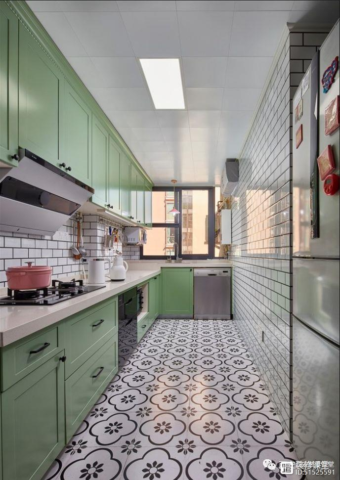
▲The kitchen is a long and narrow space with an L-shaped layout. It uses classic Nordic floral tiles and small white tiles. The green cabinets are very adventurous. I wanted it to be more natural and pastoral, so I went with the bold combinations. I didn’t expect to be so satisfied.
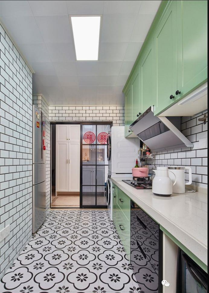
▲In the other direction of the kitchen, there is no problem with the light. The collision of black and white and green is indeed unexpectedly perfect.
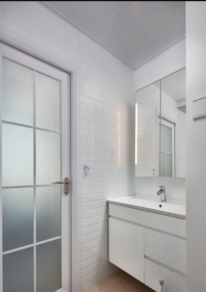
▲The bathroom is separated into dry and wet areas. For lighting reasons, small white bricks, white bathroom cabinets, and mirror cabinets are used for storage, which can provide better lighting. Ordinary metal doors are used in the wet area because of humidity.
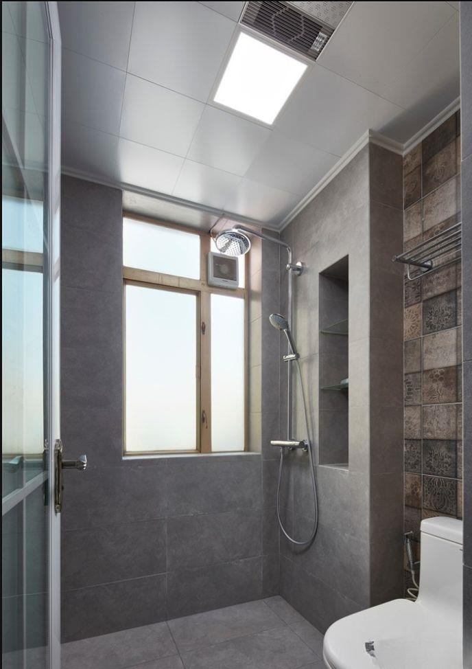
▲The wet area is paved with large areas of gray tiles, and the toilet background is decorated with flower tiles. The pipes are wrapped to create a niche design for storage, which is very practical.
How to meet the needs of three generations living in a 95m² three-bedroom apartment?
95 square meters of just-needed housing, smart female owner creates French romance
95 square meters Nordic two-bedroom, favorite gray pink
95 square meters small three-bedroom IKEA, the study room glass door space is bright
95 square meters of fresh mix of two rooms, the water heater hanging in the entrance ruins the house