110m² threebedroom apartment, perfect light industrial style
The building area is 110 square meters, with three small rooms. The layout is so perfect that no changes can be made to the original design. It just needs to be made into the desired industrial style, but it doesn't want to be too heavy, so it is positioned as light industrial with a little mix and match.
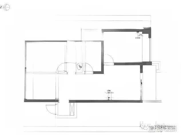
▲The original drawing shows a square apartment. There is nothing to change, and it is impossible to change more, so the layout remains unchanged. The biggest change is to demolish the study wall to make the space more transparent and take into account the guest bedroom function.
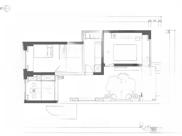
▲Layout drawing after design. The perfect foyer, although small, fully meets the function. The restaurant is very narrow, so only the booth can be used to take into account the function and expand the space.
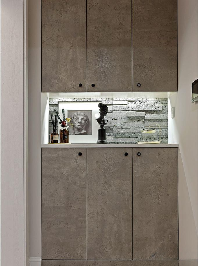
▲The sunken area directly opposite the entrance is reserved for shoe cabinets. The developer is very conscientious and has taken the function of the foyer into consideration in the early design. The old gray is matched with the minimalist black handle, the hollow is treated with lighting, and the background is paved with rough cultural stones. This is the feeling of light industry.
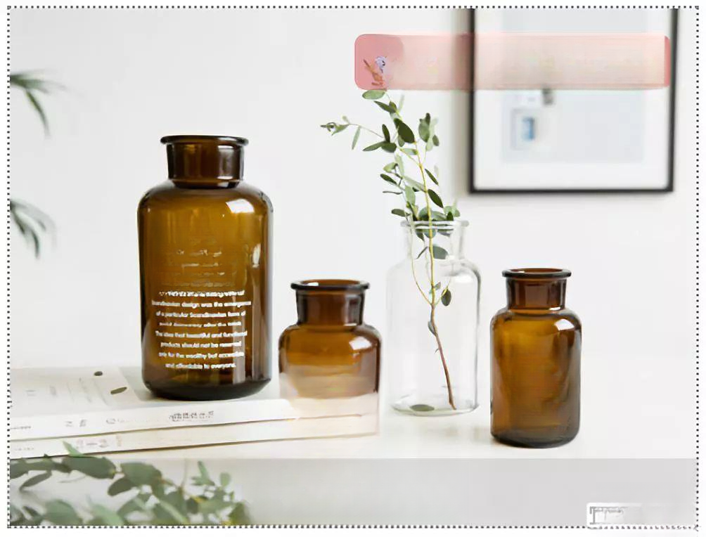
▲Recommended items, small brown bottle vase series, Nordic internet celebrity-level decoration, put it in the door shoe cabinet to enhance the appearance
▲The small room on the left after entering the hallway is used as a study. The original layout was blocked by walls and affected the light. As the study and guest room, the wall was demolished. The black textured folding door can be opened at ordinary times, and the light and sight become transparent.
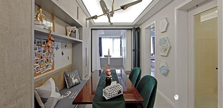
Because the kitchen and bathroom are opposite the restaurant, the span is relatively narrow, so a booth was built on one side, and both sides also function as sideboards. This way, the dining table can fully accommodate six people dining at the same time, and the aisle is relatively spacious.
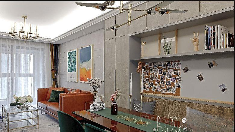
▲Turn around the dining room to see the living room space, the whole light strip ceiling treatment. The booth dining sideboard can also take into account the role of dividing the area
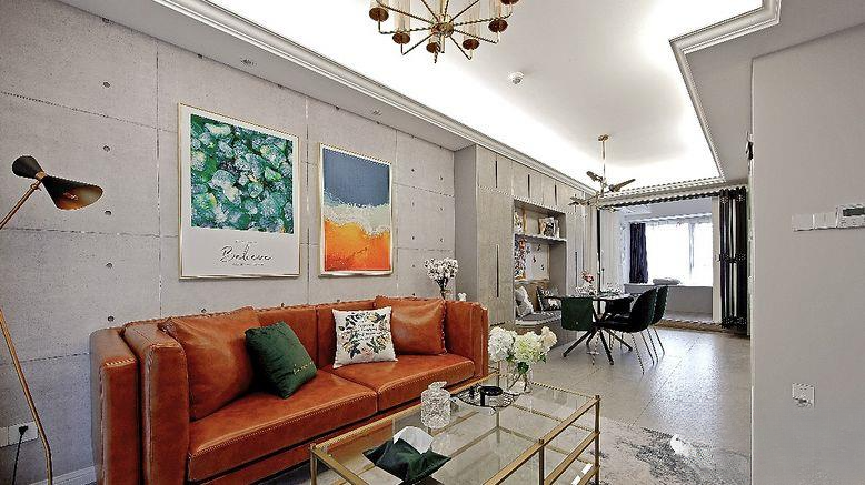
▲From this angle, you can see that the living room has a large span, while the dining room is a long and narrow space. In order to expand the visual space for an overall good look, a unified design was used when making the ceiling. Although there is a corner that is not very beautiful, the overall shape can still expand the visual space.
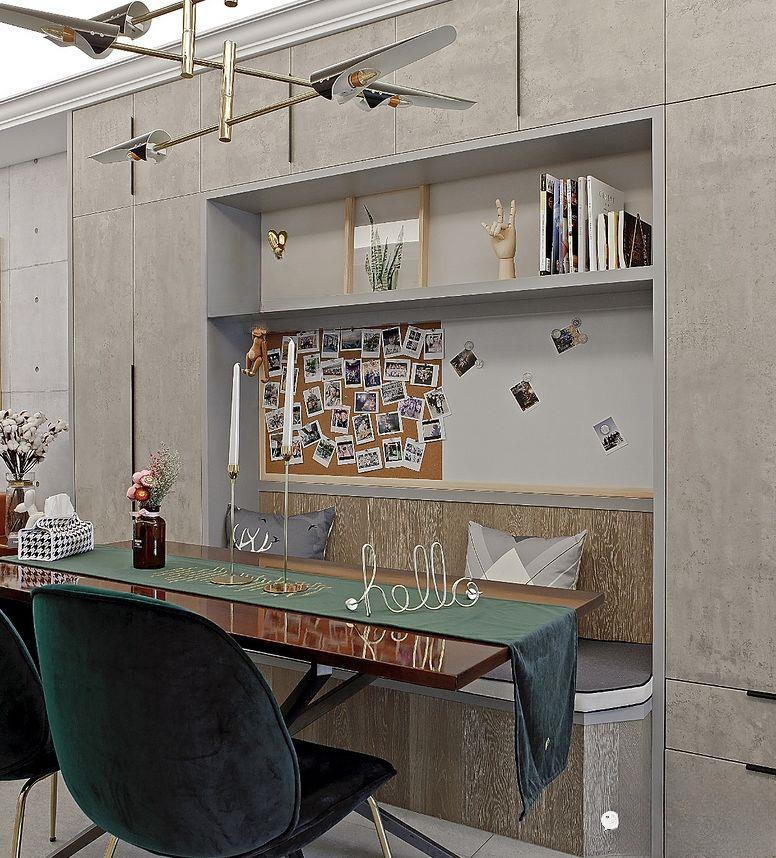
▲The booth and sideboard also use old-fashioned color treatment, with some high-grade gray coloring. The booth and sideboard are of different thicknesses, which can reduce the visual oppression of the sideboard being too thick. At the same time, the right angles of the booth are beveled, so it will not be bumped and is visually acceptable. Velvet dining chairs and tablecloths are retro and fashionable
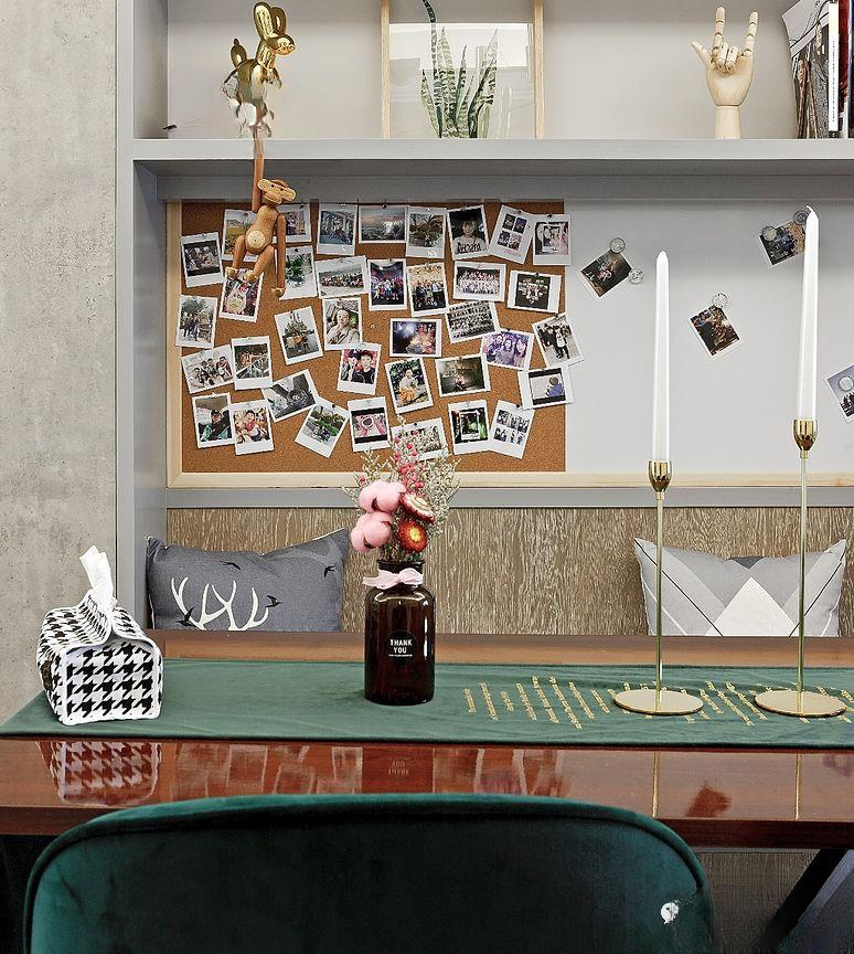
▲The background cork board and small brown bottle vase were purchased online. They are very popular decorations.
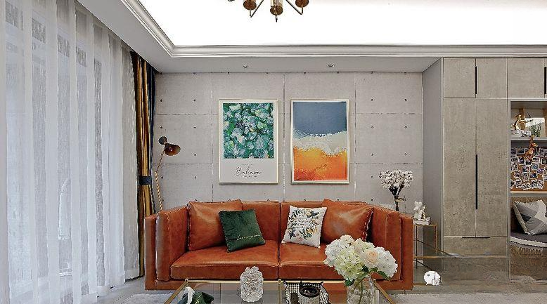
▲The sofa background is made of cement board, highlighting the industrial style. The brown leather sofa is matched with metal furniture, and the background painting echoes it. All small details are carefully selected and considered.
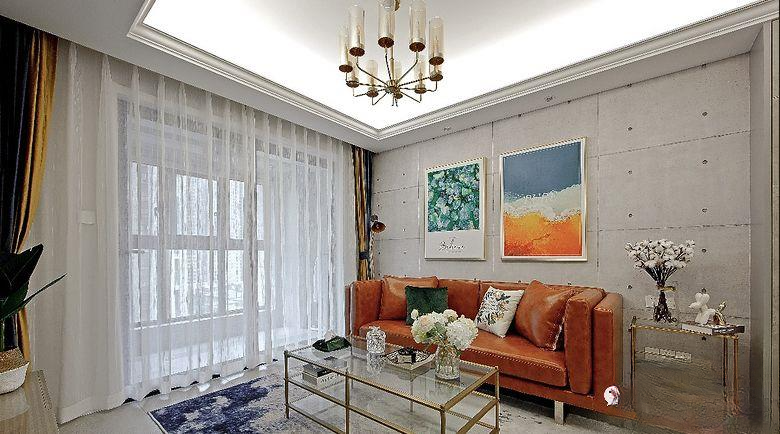
▲The two-color curtains in the living room are actually a kind of decoration. Usually, gauze curtains can be used, and the light-transmitting effect of gauze curtains makes the space more simple and elegant.
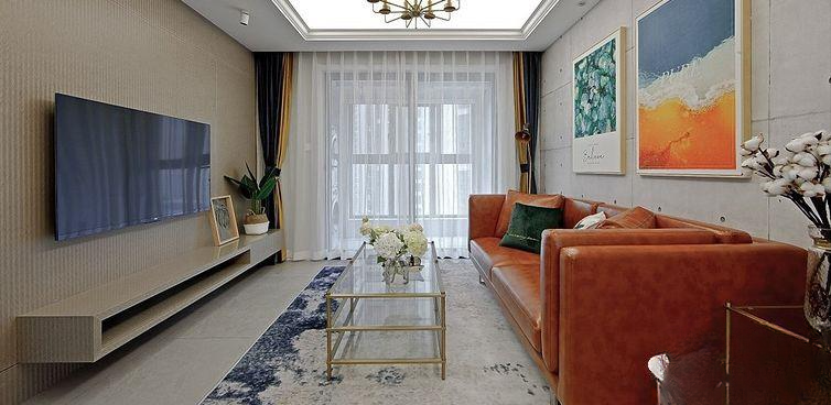
▲Panoramic view of the living room. The TV wall is made of uniform wood finish and is made in the same way as the suspended TV cabinet. It is simple and elegant.
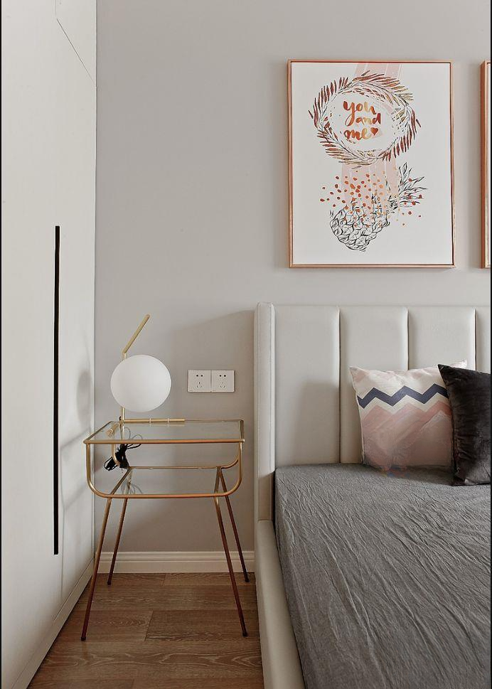
▲The master bedroom side wall wardrobe storage, light-colored leather bedding with metal side tables, and stylish metal table lamps give it a light and luxurious feel
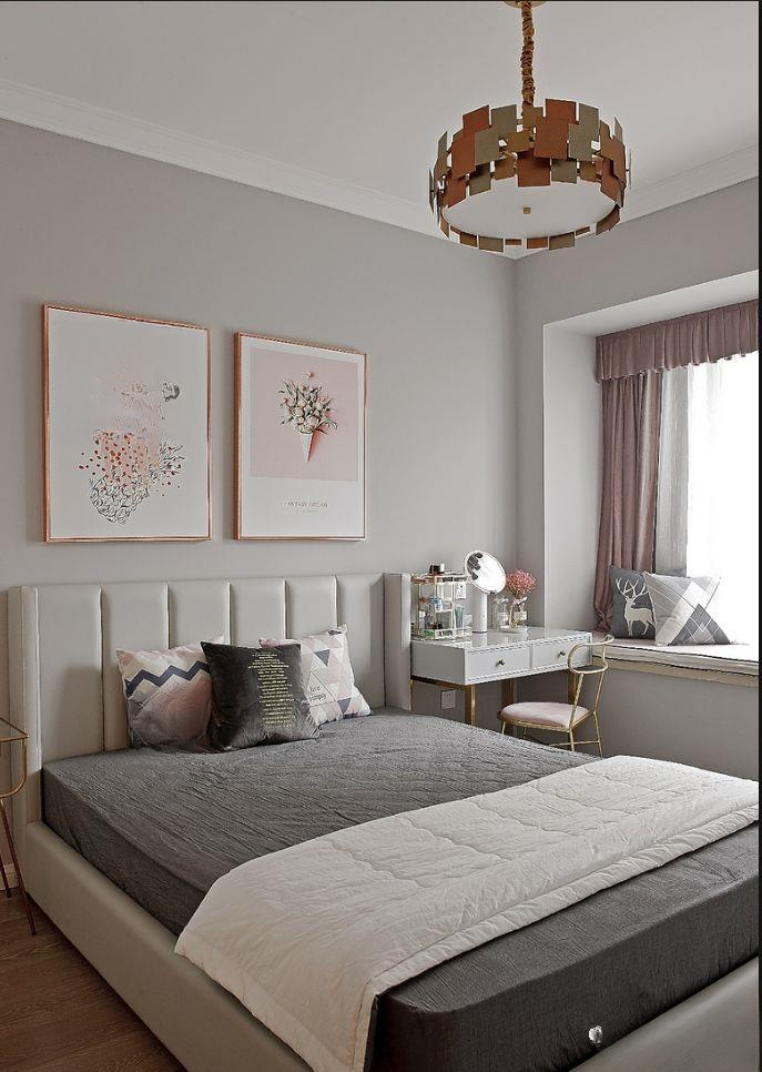
▲On the other side of the bed is a makeup table made of white paint and metal, with two large drawers for placing cosmetics. The casual bay window is decorated with fabric cushions, and the curtains are only designed on the windows, which can visually expand the space.
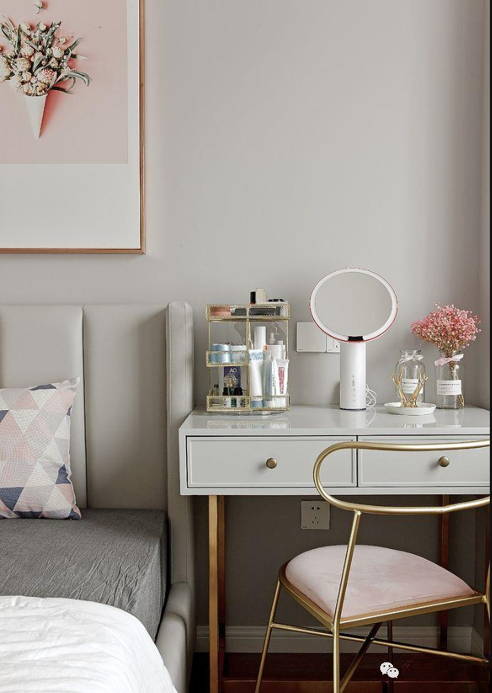
▲The metal texture adds a modern and luxurious feel to the space, which is very fashionable
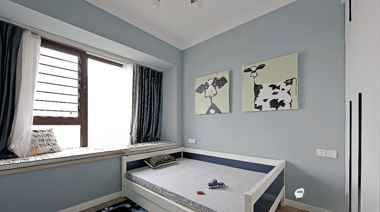
▲The children's room is relatively simple, with light blue walls, blue and white beds, side wall wardrobes, cartoon paintings in the background, and plenty of light from the oversized bay windows. For safety reasons, the windows are protected.
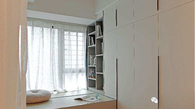
▲The study and guest room area is arranged in a tatami bookcase and wardrobe. The large area of white and gray is simple and comfortable.
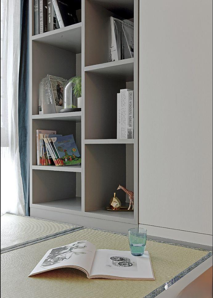
▲The wardrobe door is white and simple, and the bookcase is in high-grade gray, which is simple and elegant.
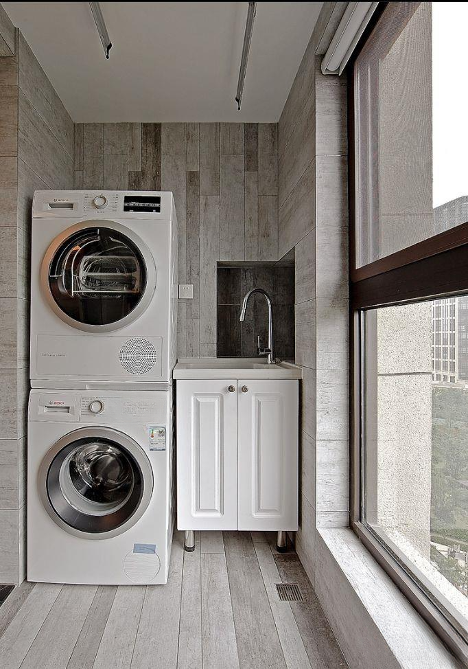
▲In order to unify the overall style, the balcony uses gray wood-grain tiles, a washing machine, dryer and a finished laundry sink.
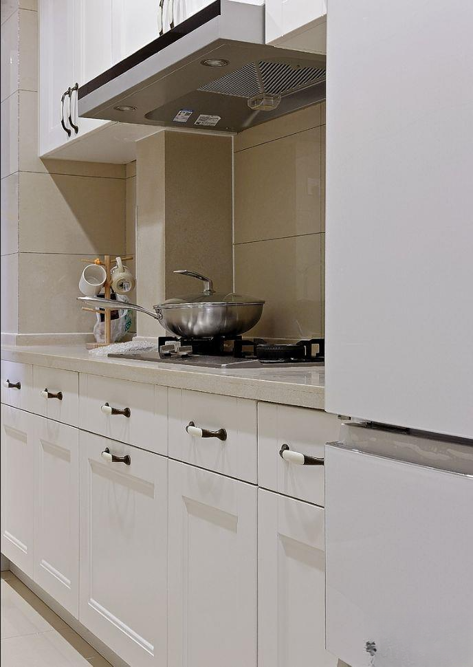
▲The kitchen uses warm-colored bricks with white molded cabinets. The drawers are also made with great care, so that classification and storage are more convenient.
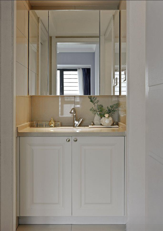
▲The dry area opposite the children's room has a custom bathroom cabinet and mirror cabinet for storage. The biggest mistake is that the mirror is not hidden, because there will be shadows when getting up at night. "Dry area mirror facing the bedroom? How to hide the mirror? 8.15"
110 square meters for a family of three, my favorite modern black, white and gray
110 square meters second-hand house with three bedrooms, toss to the desired appearance
110 square meters three bedrooms simple decoration, this effect is enough
110 square meters of American country style, small size can also be wonderful
110-square-meter modern three-bedroom apartment, fashionable and avant-garde